
It's not AI! Designing for automated conversations
Designing for automated conversations with a few practical tips and real examples from shipping live to production
Below are a few practical things we learned as a design team when building automated conversations for our two products ReferralCandy and CandyBar.

A snapshot of CandyBar Assistant. It tells people how many rewards, stamps and points they have
Why automated conversations?
For us, it all started with an experiment.
We had an SMS being sent out, and we wanted to make it better i.e. more useful, helpful, more engaging and interesting.

Trying to make the SMS shorter, cleaner, with neater links
We did a ton of usability testing on the SMS flow. The results were not great. People didn’t notice the message. It didn’t feel relevant, engaging or interesting.
We had to figure out a better way of messaging people.
Our first MVP experiment with automated messaging was with Facebook Messenger.
Results looked good! Our engagement went up, our testing lead to better results, more people were giving feedback about the places they visited, and conversions looked good too.
So here’s what I learned from the last two years of building automated conversations with my team:
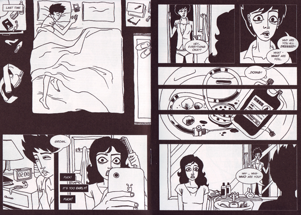
1. Don’t make it look like a human
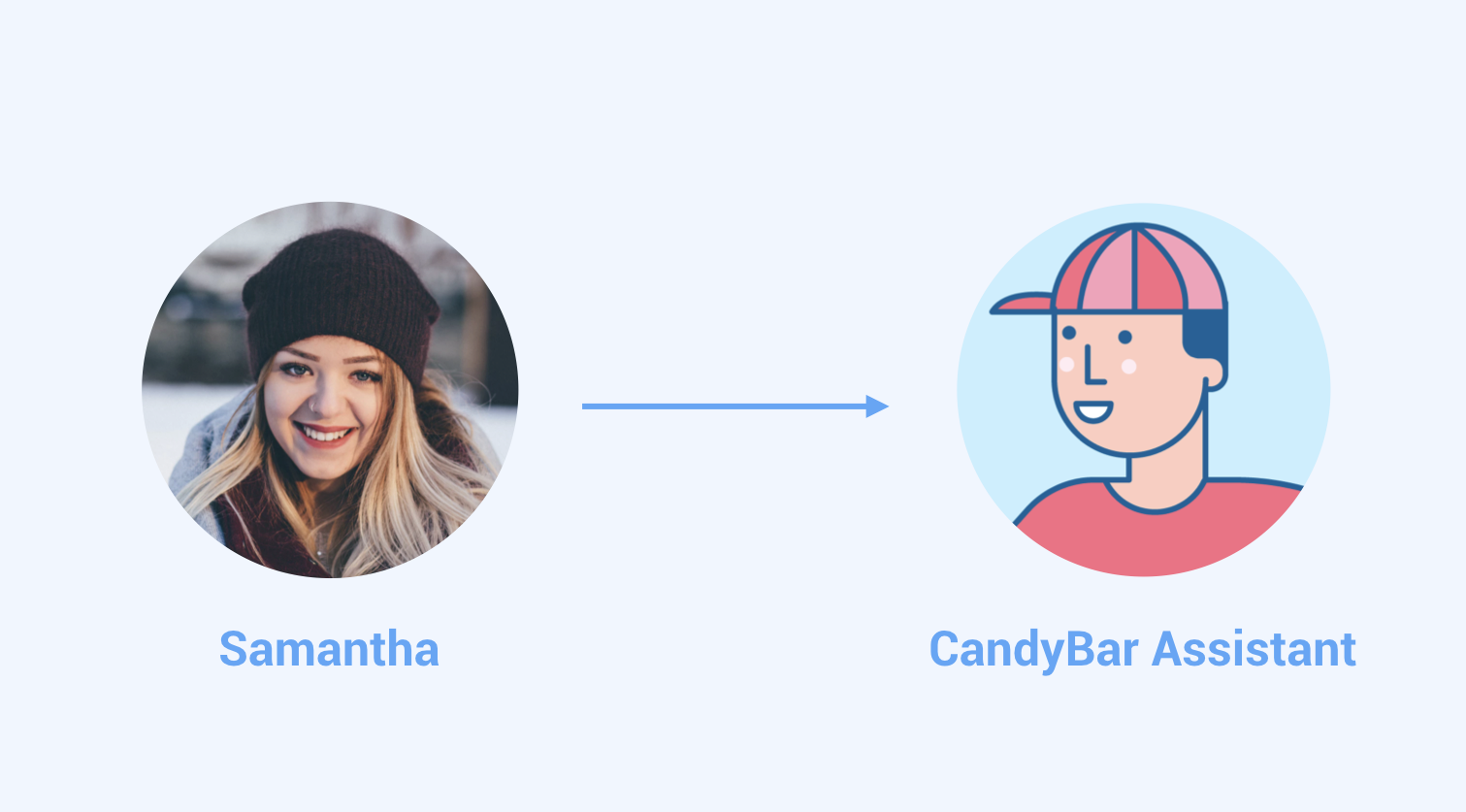
Samantha is not a real person. Her photo is from unsplash.com, a website for free to use commercial photos.
Trust is fragile in an automated conversation.
Make sure your automation clearly looks like a bot. An automation cannot do human tasks.
Be honest and transparent that it’s just a bot and therefore it’s limited. Use non-human names and avatar images.
Our product is both merchant facing and customer facing. So our interface and bots speak to both end consumers and merchants who want to connect with their customers in a meaningful way. We also have an excellent customer support team talking to these folks.
In a complex situation where both people and bots are helping out, clearly differentiating between the two is the key between a good or effective experience and a bad or confusing experience.
2. Design basics are the same, but your tools are different
Stick to a typical iterative product design process.

Your qualitative and quantitative user data is in the center of your process as you ideate and test your ideas in the real world. Make sure you are measuring the right thing. Your success metrics should be chosen carefully.
We did a lot of testing especially for the first MVP automated conversation
But your tools are different
Sketch isn’t the best way to draw your MVP Conversation
Initially I tried to make detailed mockups but my team found it difficult to understand the MVP concept and design updates this way.

Some initial sketch mockups for the MVP
We were iterating too fast (every 2 days) for good looking mockups.
What actually worked:
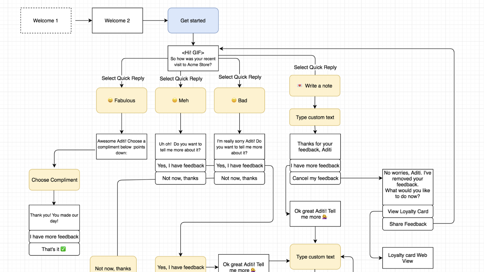
Conversation tree for the MVP
Then, write an MVP script to test each flow
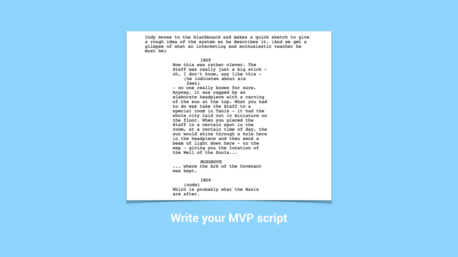
Imagine your MVP conversation like a movie script with characters, stages and scene changes. This will help you test each flow properly, so that it sounds as natural as possible.
Once you have your Conversation tree and MVP script, create some visual story elements:
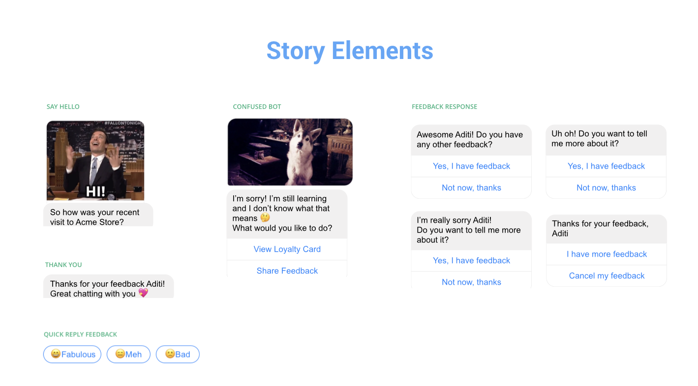
A few story elements from CandyBar Assistant
Prototyping is the best way to share your work
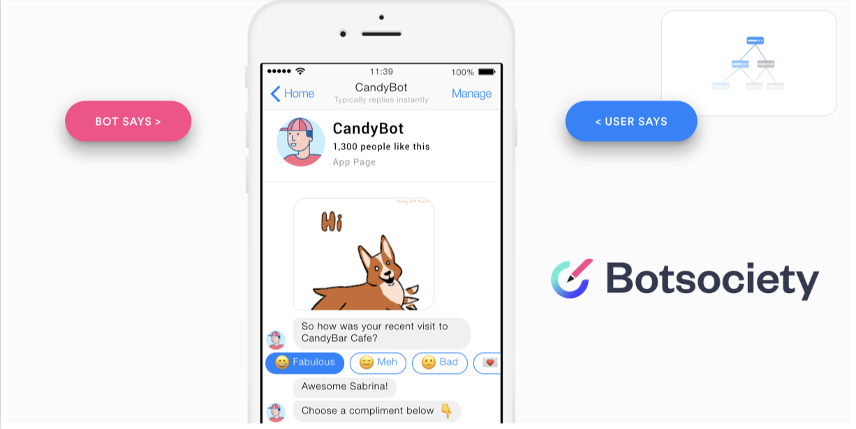
I recommend Botsociety for quick prototyping for your MVP
So in conclusion, basic design process is the same, but the tools you use are different.
3. Become a really good writer OR get a really good writer
Can’t underline this enough. Your MVP has to have good writing. It’s not optional.
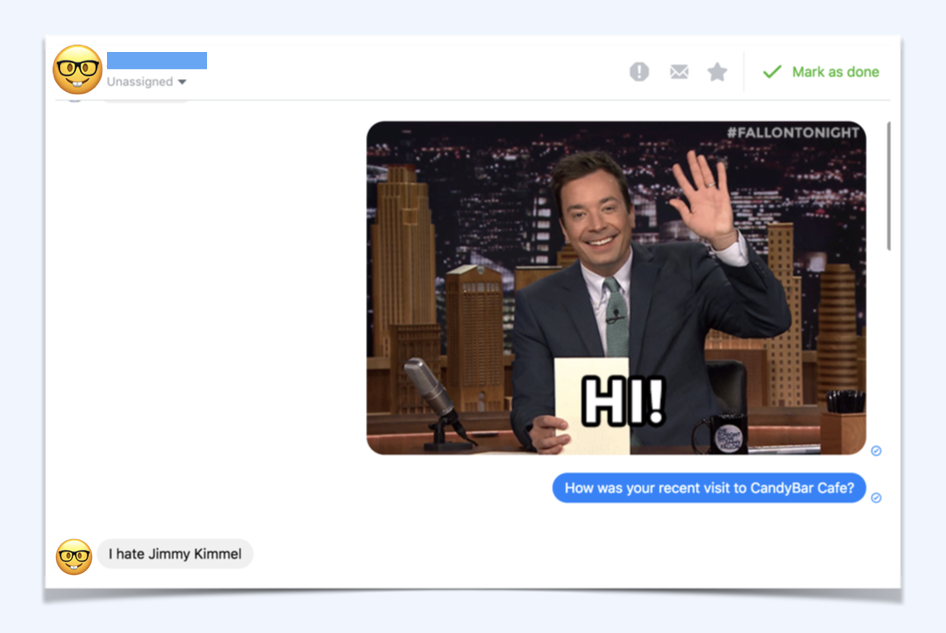
Getting a culture check is good too. Sitting in Singapore, we didn’t know this would happen with Americans using our bot. A surprisingly large number of people hate Jimmy Fallon
4. It’s ok to say sorry and I don’t know
Error handling is always important in any design process, it’s just way trickier in a conversation.
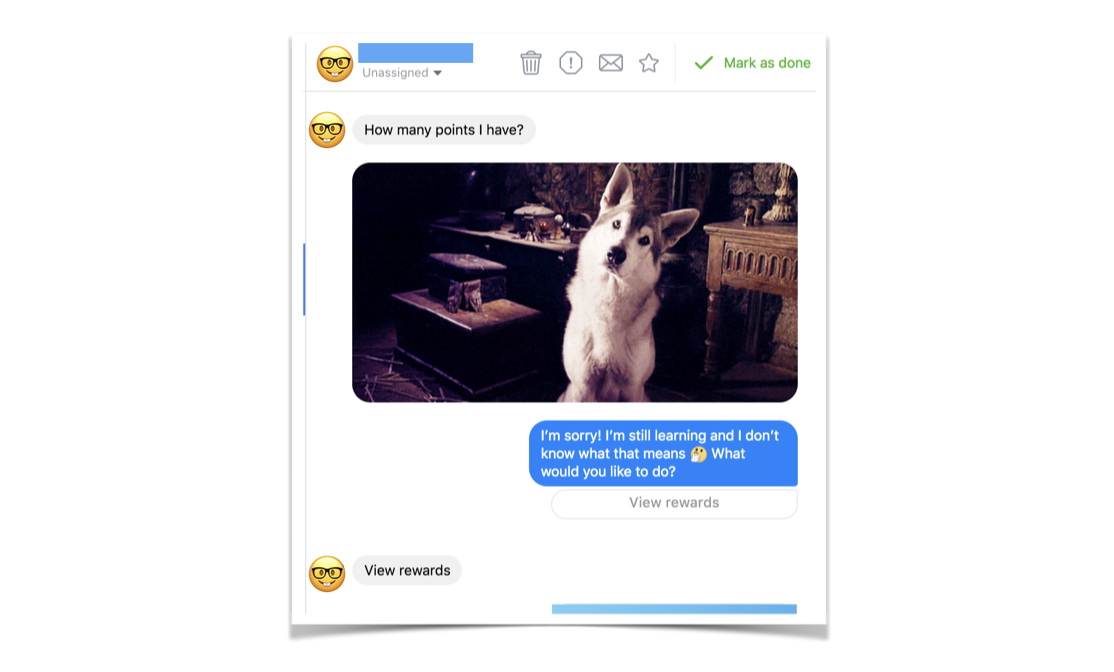
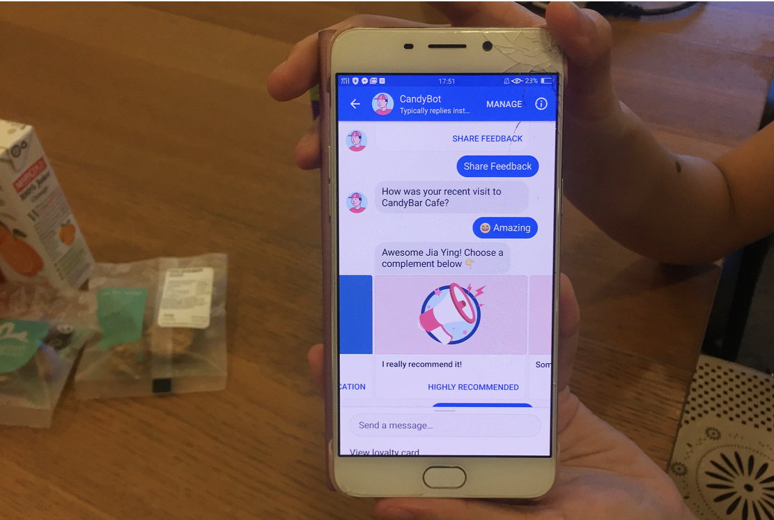
This person asks a pretty relevant question “How many points do I have?” but CandyBar Assistant doesn’t understand. It quickly apologizes, making it clear that it is limited, and provides a button so the person can find their answer anyway. By tapping on “View Rewards” this person can see how many points they have.
5. It’s not AI and it doesn’t have to be AI!
You are replacing a traditional interface of fields and labels with a rich conversation.
The bot reminds me of this olden days CLI
The bot reminds me a bit of this ancient command line interface I used to load up games when I was a kid. You put in queries, and the system did a thing. If you put in the wrong query, it failed horribly.
With an automated conversation, it’s pretty much the same Q&A format, just in a nicer, more human, friendlier wrapping. Maybe even some jokes, emoji’s and GIFS added to the mix!
You don’t have to have artificial intelligent to create a really really good experience for the people using your software that’s fun, enjoyable and also works.
TLDR:
Don’t make it look like a human.
Trust is fragile in an automated conversation
Design Basics are the same but your tools are different
Write your MVP script and test as much as possible
Get a really really good writer
It’s ok to say sorry and I don’t know
It’s not AI! It doesn’t have to be AI to be effective
Thank you for reading! This article is based on a talk I gave at UXSEA in Singapore, Nov 2018.
I’d love to hear your perspective on this, please add your comments below.

Your design career doesn't have to make sense right now
A lot of designers I meet worry about structuring their career in the “right way”. They obsess over which “industry vertical” to work in. They worry if this or that company is the right “next step”.

A lot of designers I meet worry about structuring their career in the “right way”. They obsess over which “industry vertical” to work in. They worry if this or that company is the right “next step”.
This was especially highlighted when I spoke at DBA Singapore recently about my work. It made me realize a lot of things that I’ve learned, I have learned in hindsight.
So here are some things I wish someone had told me while I was slogging out there in the design industry.
Don’t worry about some kind of overarching “narrative” in your career
It will make sense eventually (trust me).
Do what you love, learn new skills (even if they are not design related) and work with amazing people.
If you studied graphic design, don’t get too invested in the label of “graphic designer”.
Your career is not a straight up ladder (it’s a zigzag)

It’s a lot of detours, experiments, random events and luck!
Just have fun on the ride while you try to pay your rent.
If you need to learn a new skill, take that demotion if you can. That new and different skill is going to be invaluable to you in the future.
Failure is good
It makes you question and experiment more. It makes you leave your job and try something else. That’s amazing.
The more things you try the closer you are to finding the thing that is going to work for you and bring the story together (finally).
It doesn’t matter how cool the work is
You could be working for the biggest brands, the coolest clients, newest tech, the most funded startup. But it means nothing if the people suck. Work with the best people and teams. You will become a better designer.
Caring too much about the “what” you are working on is a rookie mistake.
It’s ok to quit your job in the first 3–4 months

No it doesn’t “look bad.” You tried something and it didn’t work. It’s ok!
The best time to quit a job that’s not working for you is in the first 6 months. Don’t stay and just make it worse for yourself and the team you are working with.
Go look for something better for yourself.
Thank you for reading!
What did you learn from your design career? Does your design career make sense? Let me know in the comments :)
This post was originally published on Bytes of Candy in October 2017.

Design metrics for better design decisions
This quote by Spock explains what most designers instinctively understand. It’s easy for numbers to mislead a team down the wrong path. You need to be constantly vigilant that you are measuring the right things, for the right reasons, in the right way.
So how can metrics help designers in a consistent, practical way?
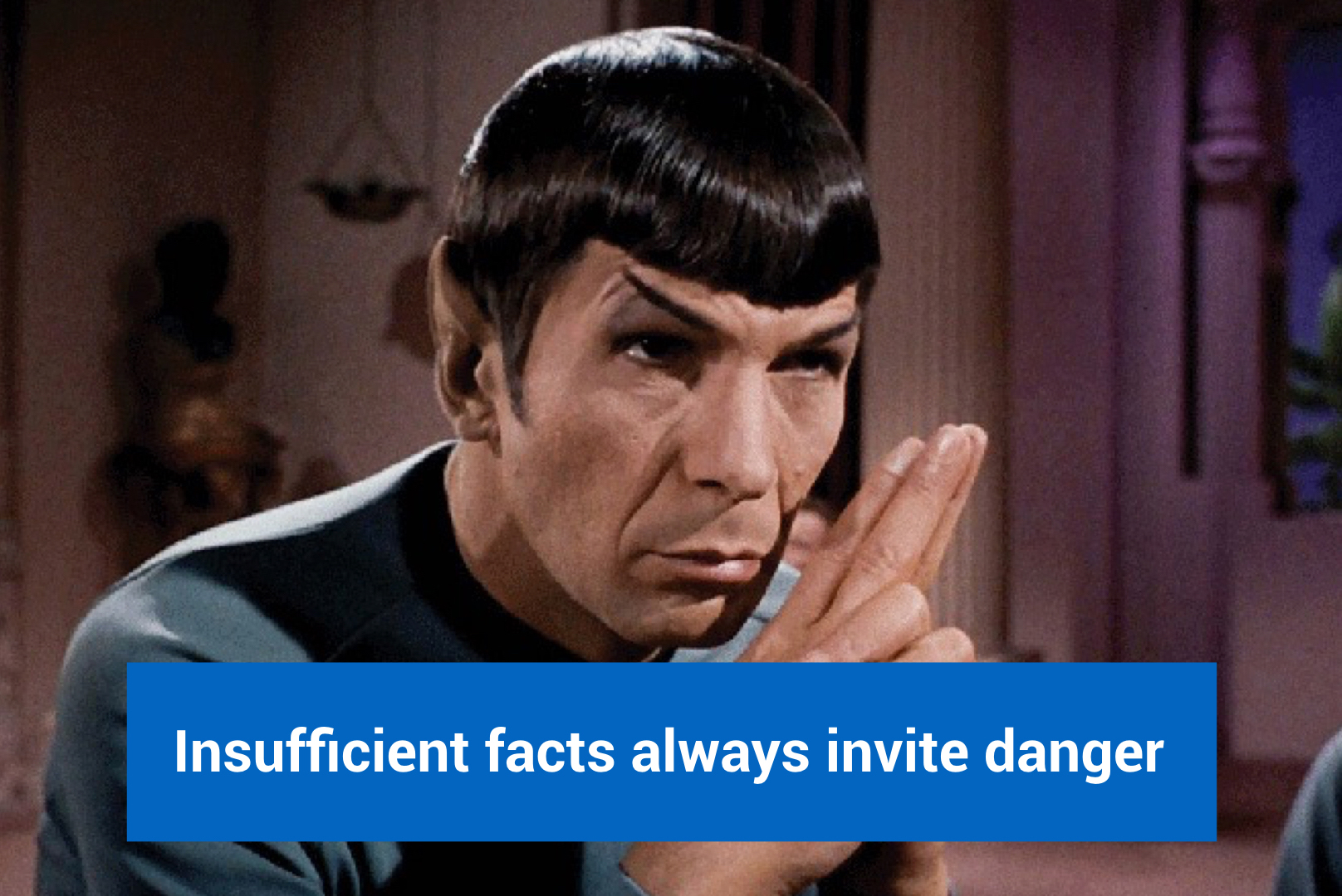
1. Funnels convert complex user behavior into neat little chunks of data

Let’s say you have an amazing number of 5000 signups/week. However this is not actionable to you a designer. Even if you have a trend on top saying signups are going up or down, that is still not helpful.
Funnels are a great way to identify starting points for a redesign. You can prioritize what needs to be fixed first by looking at conversions and drop-offs. You can even kill the entire funnel and make a new one.
2. Upgrade to a goal oriented design process (stop the opinions)

Awesome illustration by The Design Team
Design reviews often spiral into confusion and vagueness. People focus on fonts and colors when the real stuff is the interaction and user flow. Use metrics to keep everyone clear headed and on point. Especially for non-designers, it’s a great way to start learning about potential impact of good design.
Use metrics to deal with superficial stakeholder feedback like “Make the logo bigger.”

What I imagined when I read the amazing tweet above
3. Test and validate your designs
It’s not always possible to extensively test your design with user research. Especially for superficial changes, use metrics to validate your designs once they are already live in production. This is the fastest way to work in small teams. Keep checking and validating that you are on the right track with user interviews and numbers.
Any extensive research effort with both interviews and a/b testing may lead to a month of wasted time when you can always validate on the go.

Old hero tile

New hero tile
For example we recently redesigned this hero tile for our product. Instead of extensive internal reviews and testing for a relatively minor change, we went ahead and made the change in a day. Then we checked that this was working better than the older version and it was.
Conversions increased by 7%!
4. Setup your own design metrics stack
In about 3–4 weeks you should be up and running so that your design team can make more data based decisions. Depending on how your product architecture is structured, it may be easier or harder. But it’s always worth it.
There are a ton of amazing services out there that make it much easier today.
Fullstory has an amazing rage quit feature that is amazing for any designer. You can watch video session replay of people who were recently pissed off by your app or service.
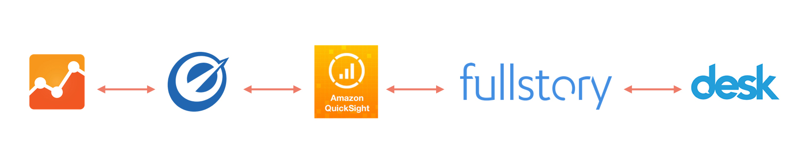
Services we use for qualitative and quantitative data. User interviews happen in parallel.
So we use GA for basic numbers, Optimizely for A/B testing, Amazon QuickSight for dashboards, FullStory for qualitative and quantitative and Desk for customer support data.
Eventually it’s really cool to have your own dashboard with all the behavior data in one place.
5. Metrics for discovery and exploration
The way people use software and apps is constantly changing. Looking at trends helps you understand user behavior at a deeper level.
You can gain new insights and convert them into radical ideas and designs for the future of your product, six months or a year from now.
Discover new usability and functional bugs

Although the engineering team is always tracking performance, sometimes problems slip through the cracks. Mysterious changes and dips in numbers can be an insight into a new bug in your product.
6. Find your user centric metrics
Joel uses our new product CandyBar
Never lose sight of the person who uses your software. It’s crucial to listen to the rich stories behind the numbers so that there’s always context.
What is success for your customer?

For example at ReferralCandy our success metric is the amount of referral revenue we help our retailers earn.

For the consumer side of our service, its the reward the consumer gets. It could be a gift or cash reward.
So really think of the user centric metric that your entire product team can get behind and design for.
User centric metrics fits neatly into user centric design
Thank you for reading! This article is based on a talk I recently gave at Tech in Asia 2017.
You can also check it out on Medium.

Creating the Jugaad Dishwasher, The X-Way
The X-Way was a 2 day workshop sponsored by Nokia and Microsoft that focused on ideas, strategies and discussion around improving Mumbai city. Ben & Andrew moderated the workshop, keeping it challenging as twenty creatives and innovators came together with many, many city ideas.
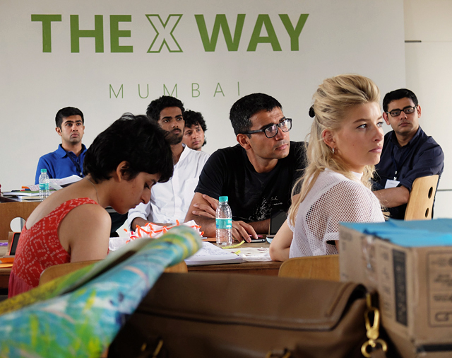
The X-Way was a 2 day workshop sponsored by Nokia and Microsoft that focused on ideas, strategies and discussion around improving Mumbai city. Ben & Andrew moderated the workshop, keeping it challenging as twenty creatives and innovators came together with many, many city ideas.
One of the interesting exercises was listing things we love and hate about Mumbai. It was heartening to see that the 'love' pile was so much bigger despite Mumbai's numerous faults.
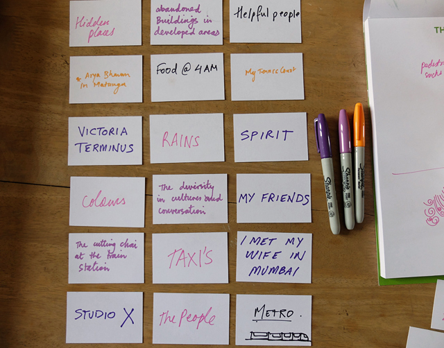
When discussing Mumbai's numerous problems, traffic cannot be ignored. Everything to do with traffic and way-finding is contextual. Signage is missing in a lot of places. When pedestrians give directions, the meaning may be different depending on the tone of their voice, how they stand, hand gestures and language. Honking has varied meanings depending on frequency, tones, loudness and the length of each honk. The city is a hotbed of large scale issues and topics of interest.
My team eventually looked at pavement ownership as a microcosm of health and sanitation. How could we encourage and create value in a public space such as pavement. We were in posh areas of Mumbai, and even here we found street hawkers taking ownership of pavements (in a good way) keeping them clean and ensuring their part of the pavement was maintained. Eventually we focussed even further and came up to a sugarcane vendor. Could we come up with something to help him wash the glasses in his stall while he was busy doing a million other things like making the juice, serving and cashing. A lot of times hygiene and proper washing was way down in his priorities while multi-tasking.
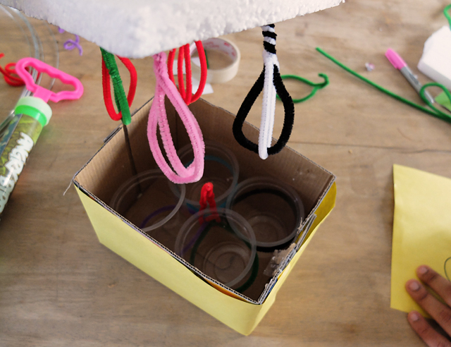
The final concept after two days of guerrilla research and quick prototyping was the 'jugaad dishwasher' - a mechanically automated machine that washed glasses saving the vendor time and effort as he ran a one-man operation. The washer connects to the juice machine itself so it doesn't need electricity to run. Soap is optional here since most vendors do not use soap. Overall the 'jugaad dishwasher' concept could also work for other street hawkers, juice vendors and with a few upgrades could even save time in someone's kitchen.
Check out some photos of the prototype we made. The video below has a few shots of us talking to sugarcane vendors.

The rotating juicer translates into the up and down movement of the simple washer, which repeatedly rinses the glasses. The trough can be easily refilled and cleaned and occupies minimal space.


Arduino Yun Workshop
The two day workshop by Ankit Daftery was a great way to dig deep into the possibilities of the Yun. As an interactive artist, I'm already aware of various options available. Trying them out was empowering and surprising. You can make complex interactions with just two to three days of effort [as a beginner], especially at an affordable price.

The two day workshop by Ankit Daftery was a great way to dig deep into the possibilities of the Yun. As an interactive artist, I'm already aware of various options available. Trying them out was empowering and surprising. You can make complex interactions with just two to three days of effort [as a beginner], especially at an affordable price.
This example converts two fruits into a drum kit, sort of a very basic version of the famous Makey Makey. Below is a short video of the test.

UX Workshop at Construkt
The workshop focussed on teaching hands-on design prototyping, taking the participants step-by-step through a prototyping process, how to think and analyse their design concept, and even a quick ten minute guerrilla user research at the festival grounds.

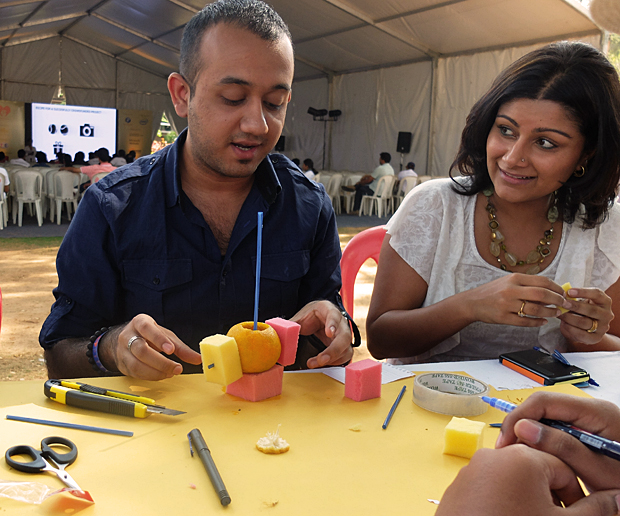
The workshop focussed on teaching hands-on design prototyping, taking the participants step-by-step through a prototyping process, how to think and analyse their design concept, and even a quick ten minute guerrilla user research activity at the festival grounds. It was rewarding to see the 25 participants get so involved and excited about what they were building. Below are some pictures of the three hour session. It started with some warm-up creative thinking activities, after which the participants chose a random 'everyday-life' object. They then proceeded to redesign it, much to their surprise! One of the participants chose an orange as a common 'everyday' object for the first exercise and ended up 'redesigning' it into a scent dispenser and pen holder. Every participant had a set of raw materials such as card paper, straws, tape and foam pieces to use. UX Workshop participants at the Construkt Festival, Bangalore. The Construkt team gave me a beautiful location under a giant tree on the festival grounds, so everyone could work in the outdoors.

UX participant shows off his prototype, a redesigned Table Tennis racket as part of a completely new type of Table Tennis.
UX workshop participants at the Construkt festival, Bangalore. One of the central goals of my workshop was to make it hands-on learning, and also ensuring it was fun. It is so important to enjoy these exercises since it makes people more relaxed and therefore more creative.
UX participant shows off his smart watch prototype at the end of the workshop. The last stage included quick user research, getting reactions from people wandering around the festival and trying to make last minute adjustments on the first level prototype.

Creative Workshop at Sourcebits
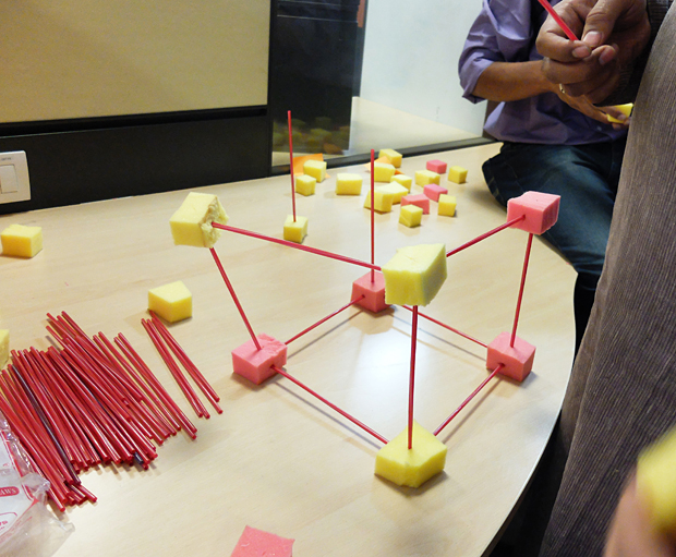
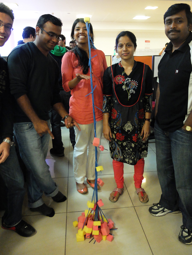
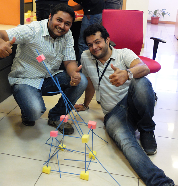
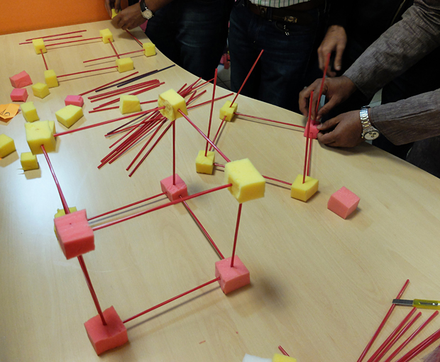
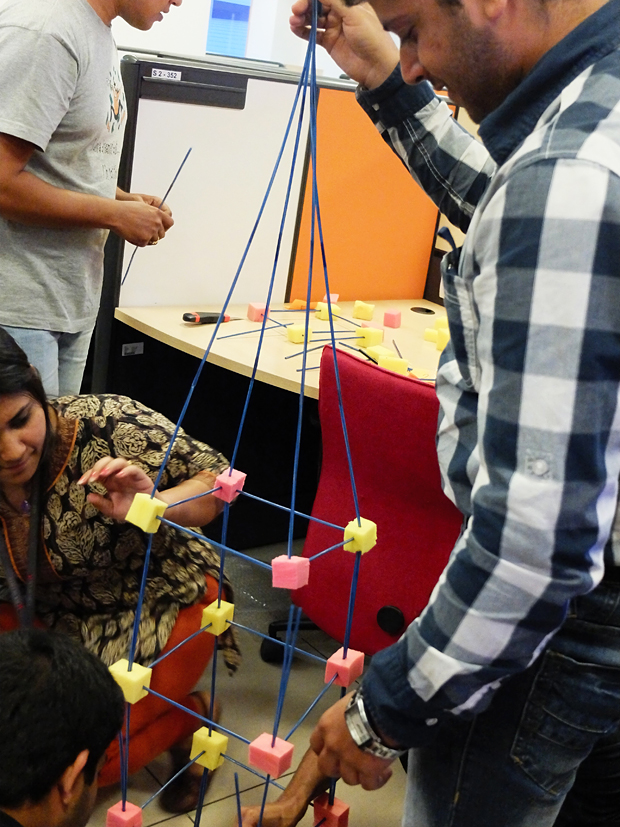
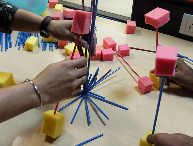
nspired by the Marshmallow Challenge Ben and I organized a creative thinking workshop for the lively crowd at Sourcefest, a two-day hackathon for the employees of Sourcebits. The aim of the session was to get people excited and energetic, and of course get their creative juices flowing. Instead of using marshmallows and spaghetti, I sourced waste foam material and straws. The idea of wasting so much food just didn't make sense [especially in India]. 45 people attended the session.
Inspired by the Marshmallow Challenge Ben and I organized a creative thinking workshop for the lively crowd at Sourcefest, a two-day hackathon for the employees of Sourcebits. The aim of the session was to get people excited and energetic, and of course get their creative juices flowing. Instead of using marshmallows and spaghetti, I sourced waste foam material and straws. The idea of wasting so much food just didn't make sense [especially in India]. 45 people attended the session. Rules were pretty simple, use only straws and foam cubes, no glue/sticky tape is allowed, and the tallest structure wins. And the tricky part - the tallest point of the standing structure has to be a piece of foam.
Very rewarding to see everyone have so much fun and make crazy structures. Here are some pictures from one hour session.


NID Talk
NID Talk Mobile UX - What it's like to design and create iOS and Android apps today.

It was a healthy turnout of about 45 students, still in their first years studying Interaction Design. Talking about my work from the past six years helped me look at it in a completely different perspective, basically the breadth of different types of projects I've done, and what interested me the most. It was titled 'Mobile UX - What it's like to design and create iOS and Android apps today.'
Students were full of questions, which is a great sign. Post talk discussions brought up several interesting topics, such as power dynamics between designers and engineers in the industry today. One thing I always stress is respect - engineers are the ones implementing your work so a healthy respect goes a long way especially in large companies and situations when engineers are part of a client team. Another thing that interaction designers should strive towards, and something I struggle with everyday, is keeping up to date with the latest tech so you can converse intelligently with the team.

One of the stories I like to tell at such talks. Check out the full article here.

NID Bangalore is a R&D hub for design in India. Image Source.

Gallery Reflexive
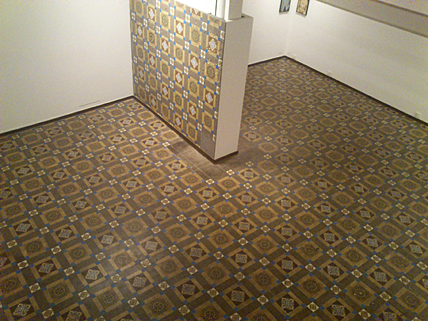
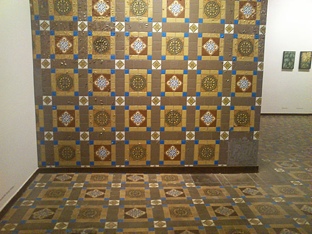
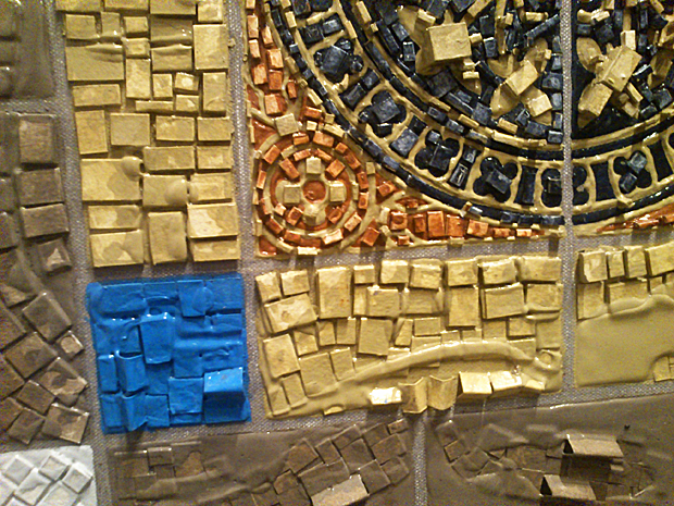
Work by Prajakta Palav. It caught my eye because of the way she had used the gallery floor in her work. It is intelligent and relevant, especially in these old buildings in South Mumbai that are converted into gallery spaces.
Prajakta Palav (Dec, 2011). This caught my eye because of the way she has used the gallery floor in her work. It is intelligent and relevant, especially in these old buildings of South Mumbai that are converted into gallery spaces. What I love about this is how the work is almost indistinguishable from the gallery floor at first glance. It makes you sit up and pay attention. Here are some pictures I managed to take from my mobile phone.


Mumbai's First Comic Con

Mumbai's first comic con was crowded and full of enthusiastic fans and artists. I even met several NID alumni and graphic designers, so I'm hoping there will be another one next year. Amongst the notable independent graphic novels being sold, the ones that caught my eye were Hush: A Silent Scream, Twelve: Prelude 0.2, Milk and Quickies and The Itch You Can't Scratch.
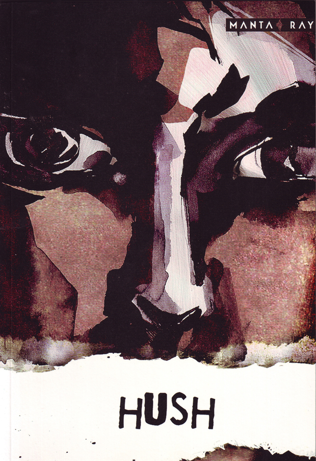
Hush by Pratheek Thomas and Rajiv Eipe. Manta Ray Comics, India.
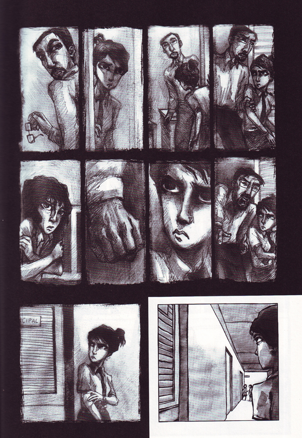
Detail, inside page.
The preview of the book is beautifully illustrated and literally breaks the silence on a socially relevant and taboo topic with a depth of understanding. It gave me so much hope for the future of independent art like this in our cities.
Twelve: Prelude 0.2 by Jasyot Singh Hans and Prabha Mallya. A collection of short stories.
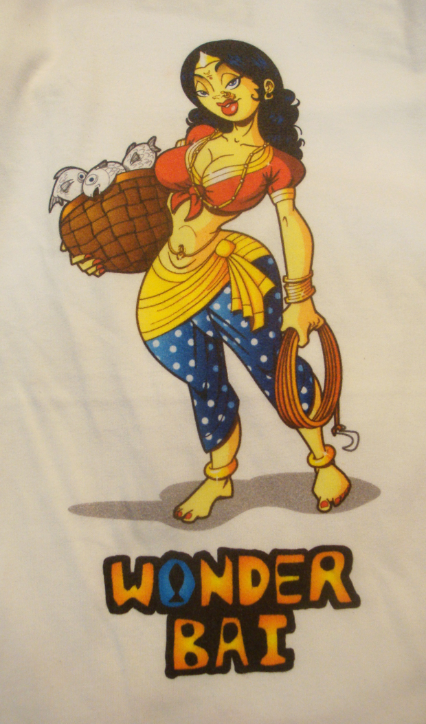
Wonder Bai by Abhijeet Kini, a hilarious series. Others such as Wolver Anna, Angry Moushi etc. were also sold.

Neon Workshop

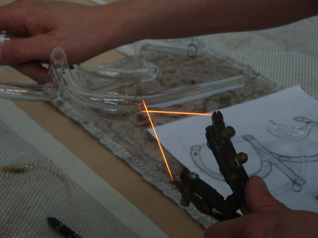
The neon workshop was a one-day crash course on making neon lights. Detailed demonstrations on how to bend glass tubes, suck out all the air and then fill the tube with either neon, argon or helium took up the first half of the day. The second half was spent exploring the material, after which we were given free reign on the propane blowtorches!! :)
Cutting a glass tube
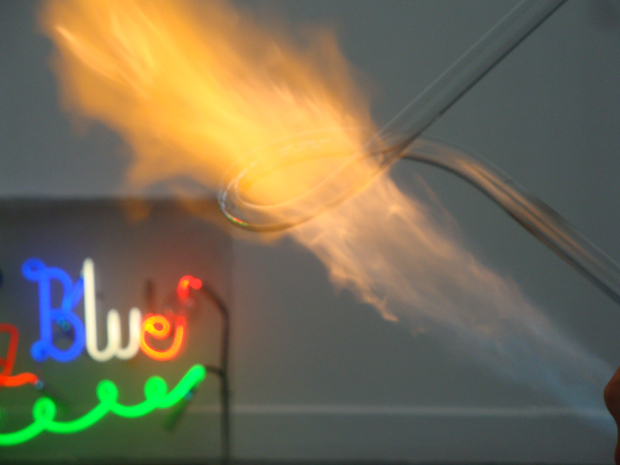
Glass tubes are bent after careful heating in the right angles, using gravity. Results like this only come after lots of practice.
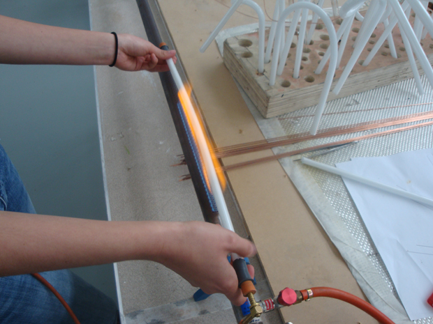
The ribbon burner has a long flame that softens a large part of the tube evenly.
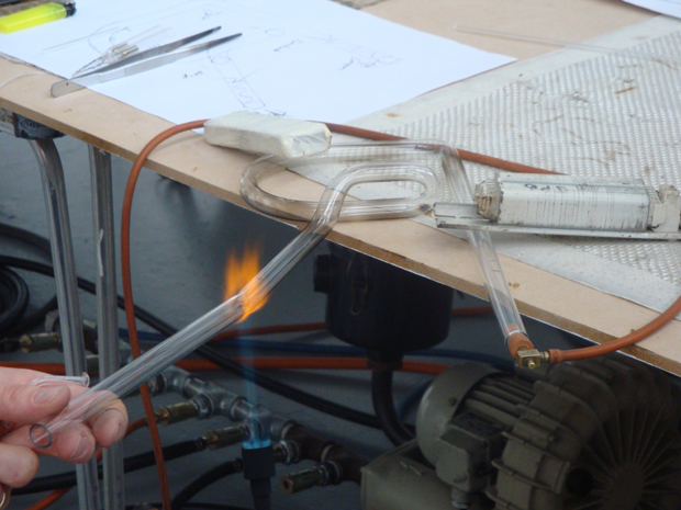
Joining two glass tubes using a precise burner was extremely difficult. I totally failed at my attempt, I ended up blowing a glass bubble instead because of too much air, and then the bubble burst. A tube with a hole can never be used for neon.

Part of the giant machine that creates a vaccum in the tubes before filling it with the required gases.
Neon master Julia Bickerstaff and British artist Richard Wheater encouraged us to question the limits of the material and explore its potential in relation to our individual art practice. That was the best part, being introduced to a completely new medium and told to freak out with it on the same day. Also worth mentioning was how to transcribe an idea into a drawing for neon-making.
The video below is my work (made by Julia of course) which we filled with helium. I love the colour of helium, its a natural pink hue that went well with the concept, which is the number sixty-nine in Devanagari letterforms. Due to a few impurities added in the tube flickers continuously, an effect that I really really wanted to try out. Another way to do this would be to programme it to flicker. However this is purely physical and does not need any external controls.
The best work was displayed later at the Light Night festival in Bournemouth town center and the Neon: Shaping Light exhibition at the text+work gallery.
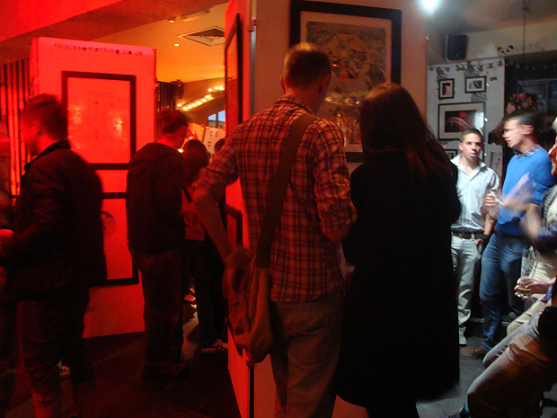
Shift Exhibition

Have a look at our post-graduate show Shift. This friday (9th September) is the last day so don't miss it if you're in or around Bournemouth :)

Artist Yi Lu with her paper mache world
Subconscious Form by Shiro Araki

Urban Brick by Bana Toutounjee

by Taro Morimoto

Mumbai/Bombay by Aditi Kulkarni

New Blindness by Rocco Nahas

A stretchable movie by Richard Hurst.

Be-Bee Project by Kaya J. Lee
The Ophelia Project by Samantha Else.


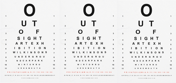
Out of Sight
With an unused underground car park as its gallery walls, Out of Sight investigates the resilience and flexibility of art, and the need for its development with supporting communities in unorthodox circumstances: an appreciation for the otherwise overlooked in the chosen location compliments the political provocation of the role of the outsider in society and rebellion against industry precepts.
 The exhibition Out of Sight is from 17th to 24th of September from 11am to 6pm and will showcase a wide variety of artwork from multimedia installations to sculpture and drawing.
With an unused underground car park as its gallery walls, Out of Sight investigates the resilience and flexibility of art, and the need for its development with supporting communities in unorthodox circumstances: an appreciation for the otherwise overlooked in the chosen location compliments the political provocation of the role of the outsider in society and rebellion against industry precepts.
Below is a video by Michael Compton of day two of the massive clean-up of the dark, unused space.
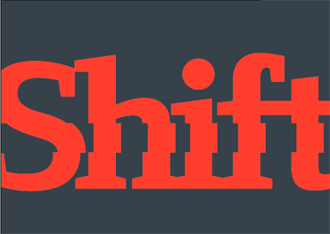
Shift
Shift the post-graduate show will be held at the Arts University College Bournemouth from 2nd to 9th September, open from 10am to 4:30pm daily. Entry is free. The show will be open for a late night viewing on the 8th (Thursday) and is closed on Sunday.

 Shift the post-graduate show will be held at the Arts University College Bournemouth from 2nd to 9th September, open from 10am to 4:30pm daily. Entry is free. The show will be open for a late night viewing on the 8th (Thursday) and is closed on Sunday. The Facebook page is here.
Don't miss it! The exhibition will showcase the work of post-graduate students in Animation, Contemporary Performance, Graphic Design, Interactive Media, Costume, Fashion, Fine Arts and Photography. The work will reflect the multidisciplinary nature of the post-graduate course here at AUCB, and each student's individual pathway.
Stay tuned for more updates on the show. And if you can't make it don't fret, I will be posting photos and videos of the awesome event :)
Update: Photos and videos here.
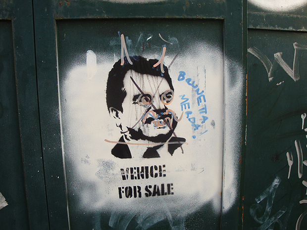
The Walls of Venice
Photographs of graffiti and posters on the walls of venice, during the time of the venice biennale.


A few photographs of graffiti and posters during my recent visit to the Venice Biennale.
Exhibition at 60mpc
My poster exhibited at 60 mpc's This is the Start of Summer event.


My illustration work was sold at the event "This is the Start of Summer" at 60mpc, Bournemouth UK. Above are photos of the event and the illustration itself.
Surrealism in Graphic Design
An overview of the talk on surrealism in graphic design by Rick Poynor, founder of eye magazine.
Rick Poynor's talk about Surrealism in graphic design was inspiring and refreshingly idealistic. He is an influential writer on visual culture and founder of Eye magazine. He started off by saying that surrealism is about transforming the world, a kind of 'poetic expression' and document of the 'marvellous'. To surrealists' the term marvellous is something transformative, beautiful and uncanny.

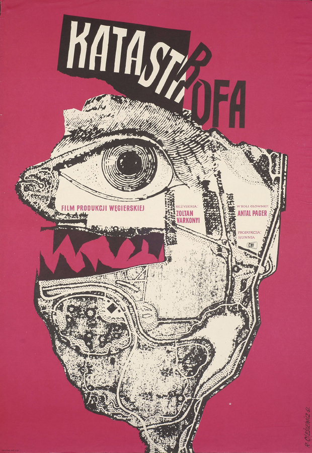
Katastrofa by Roman Cieślewicz (1961). From the archive of the Moravian Gallery in Brno. [Image Source].
Poynor argues that the clinical and grid-based designs being mass-produced today in the UK are a symptom of a much larger social control. The mobile phone that is supposed to free you is actually putting you into a node. He suggested that we should avoid 'submitting to the grid.' Instead he showed us brilliant examples of Polish and Czech graphic designers who created unforgettable images using surrealist elements. There are various ways to create this surrealist feeling: random juxtaposition, doubles, repetition, and of course the use of dolls. The images should make you feel uncomfortable, repelled and at the same time attracted to the work.

From the archive of the Moravian Gallery in Brno. [Image Source].
This image above by Jan Švankmajer is an excellent example of the kind of surrealist work Poynor emphasized in the talk and his earlier exhibition about the same topic.

^ by French artist Marion Bataille. From the archive of the Moravian Gallery in Brno. [Image Source].
Poynor goes on to mention that none of this may be "true" surrealist art since a true surrealist has sworn into the surrealist manifesto. You could say that this use of surrealist imagery in advertising and movie posters is a commodification of such ideals. We cannot deny however that surrealism, even as a term, has diffused into the mainstream, though not necessarily in the way that the original surrealist intended the term and imagery to be used.
Finally Poynor laments the absence of disruptive graphic design in UK and London, especially in the London tube. By encouraging students like us to pursue our individual expression, he hopes for a 'visual culture that reflects humanity in all its complexity.'
Reference
Poynor, R (2011). Surrealism in Graphic Design. Arts University College Bournemouth. 13th May.
Design Observer Blogs. (2010) Uncanny: Surrealism and Graphic Design. Available from: http://observersroom.designobserver.com/rickpoynor/uncanny.html [Accessed 15th May 2011].
Moravian Gallery in Brno. (2010). Uncanny: Surrealism in Graphic Design by Rick Poynor. Available from http://www.moravska-galerie.cz/moravska-galerie/vystavy-a-program/aktualni-vystavy/2010/cosi-tisniveho-surrealismus-a-graficky-design.aspx Accessed [15th May 2011].

Mumbai Noise
I spoke to several people who had never visited India, and collected their reactions to recorded street sounds from Thane. I asked them how the sound made them feel and what it reminded them of.

Noise is 'part of the experience of the urban' (Barry, 2000, p.170). I am interested in how it can be used to transport people to an other place, to create a visual experience with sound alone. In his essay on Noise the author Andrew Barry (2000, p.168) says:
For Russolo, far from seeking to block out this noise, modern composers should listen to it and learn from it. In doing so they should not attempt to produce pure sounds, which were, in his view, 'estranged from life'.
The author states that though during futurist Luigi Russolo's time the modern city was a noisy place, today 'it is increasingly blocked out, dampened down or simply displaced' (Barry, 2000, p.170). It is easy to disagree since in a developing city such as Mumbai we suffer from dangerously high noise levels, a problem that is getting increasingly difficult to contain.
Russolo's futurist manifesto The Art of Noise inspired me to study the topic further. It is fascinating to read his account from 1913, where he literally predicts the rise in popularity of electronica, techno, trance and industrial rock (Russolo, 1967, p.5):
Nowadays musical art aims at the shrilliest, strangest and most dissonant amalgams of sound. Thus we are approaching noise-sound. This revolution of music is paralleled by the increasing proliferation of machinery sharing in human labor. In the pounding atmosphere of great cities as well as in the formerly silent countryside, machines create today such a large number of varied noises that pure sound, with its littleness and its monotony, now fails to arouse any emotion.

[Image Source] ^Russolo's mechanical orchestra.
This lead me to compare the unedited urban Mumbai sounds with Russolo's work with the mechanical orchestra, a relevant example is Risveglio Di Una Città 1913:
It has opened a whole new world in terms of how I can edit raw street sound and the various ways I can integrate it within a space. Using similar fantastical "noise-music" from Mumbai I can create an atmosphere and place that is inherent to the city.
Reference
Ananthakrishnan, G. (2010). Mumbai Diwali Decibel Levels: Cold Comfort. Nov.6th 2010. Digital Journo. [online]. Available from: http://digitaljourno.wordpress.com/2010/11/06/mumbai-diwali-decibel-levels-cold-comfort/ Accessed 14th May 2011.
Barry, A (2000). Noise. In: Pile, S. and Thrift, N. (eds.) City A-Z. London: Routledge.
Naik, Y. and Khera, D. (2011). IIT-B Demands Noise Barriers. Mumbai Mirror. [online]. April 17th 2011. Available from: http://www.mumbaimirror.com/article/2/2011041720110417030951301232b713d/IITB-demands-noise-barriers.html [Accessed: 13th May 2011].
Russolo, L. (1967). The Art of Noise, futurist manifesto 1913. [pdf]. Something Else Press. Available from: http://www.ubu.com/historical/russolo/index.html [Accessed 13th May 2011].
Rebello, S and Lohade. U. (2011). Sound and fury in Mumbai. Hindustan Times Mumbai. [online] April 20, 2011. Available from: http://www.hindustantimes.com/StoryPage/Print/687364.aspx [Accessed 12th May 2011].
Wikipedia (2011). The Art of Noises. Available from: http://en.wikipedia.org/wiki/The_Art_of_Noises [Accessed 13th May 2011].
More on Mumbai Lights

 ^Texture: Projecting on the floor carpet.
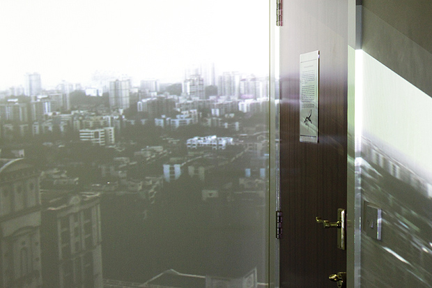
 ^Distorted night video on the same door.
 ^Texture: Regular projector produces visible lines and pixels that cover the wall.
This is a series of experiments on how Mumbai city lights and sound interact with familiar spaces around me. Earlier I used overlapping projections and shadows to express a conflicting bipolarity within Mumbai. As I attempt to integrate relevant space and sound into the experience, location is one of the most important factors that come into play. One option is to use the projections and video in a suitable outdoor space, and the other is to use a place personal and familiar to me, referencing my memories of the city and my identity as a Mumbaikar. Here I've experiments on the walls, ceiling and floor carpet, observing the effects of the night videos and day videos on various coloured surfaces and corners. The results encouraged me to try more spontaneous variations, rather than make just one well-planned installation.

Projecting on Textures
Stumbling on the photograph below inspired me to explore projections on outdoor urban surfaces such as cement. The massive pillars give shape and personality to the projected paintings, changing their meaning.

"An extraordinary exhibition held in former bauxite mines in Provence. The hollow caves and pillars are used to project images, constantly changing and overlapping each other." Photo and description by dorsetlass @ flickr.