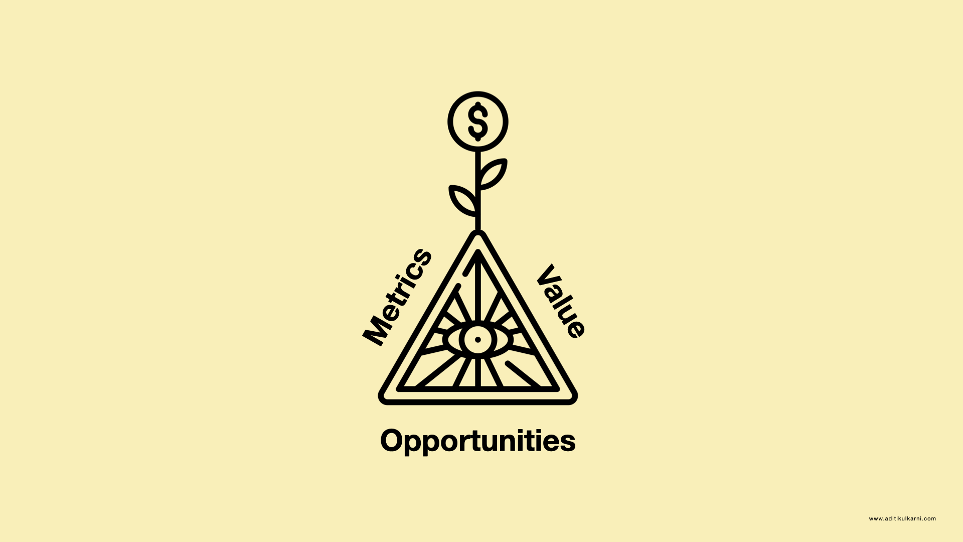
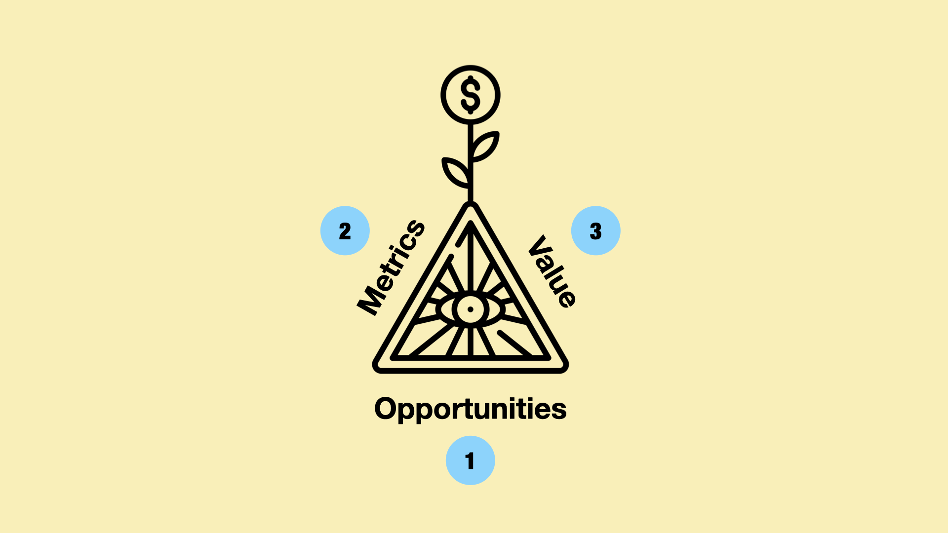
The Growth Triangle: Opportunities, metrics and value through design
The growth triangle is a framework that outlines three main techniques to grow your product using design. This is a long form visual essay. You can jump to the sections below or just scroll to read:
How do we as designers drive growth?
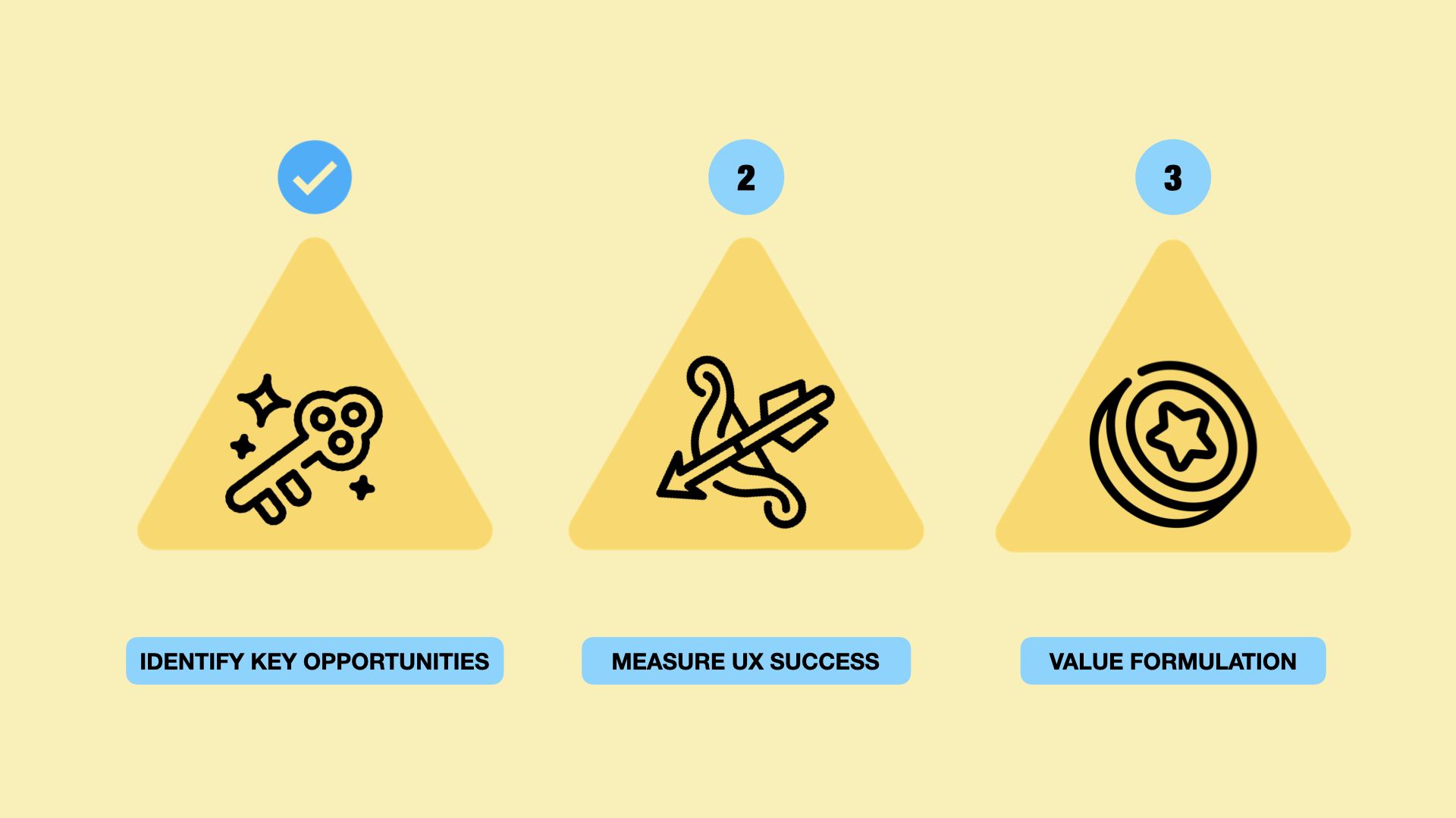
There are three sides to it:
First, identity key opportunities for growth through design
Second, measure your designs impact
Third most important is value formulation (design ROI, explainability and stakeholder influence). The third step is the hardest part :D
None of these are shortcuts but combined together they can have a massive effect.
Growth can mean different things depending on what business or software you are trying to grow. It could be:
Acquisition of new customers
Retention of existing customers or loyalty
Increasing onboarding conversions
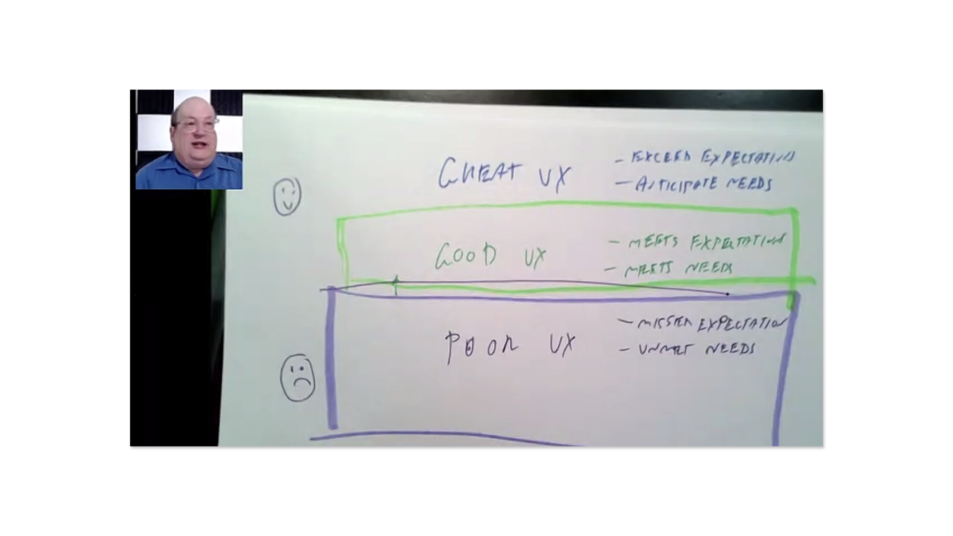
I attended a talk in 2023 where Jared Spool said we can grow from poor UX, to good UX, to great UX. He defined poor ux as missed expectations, unmet needs. Good UX is meets expectations and meets needs. Great UX is exceeds expectations and ancticipates needs.
When we are identifying opportunities for growth we are trying to level up the user experience and this is one way of looking at it.
1) Opportunities
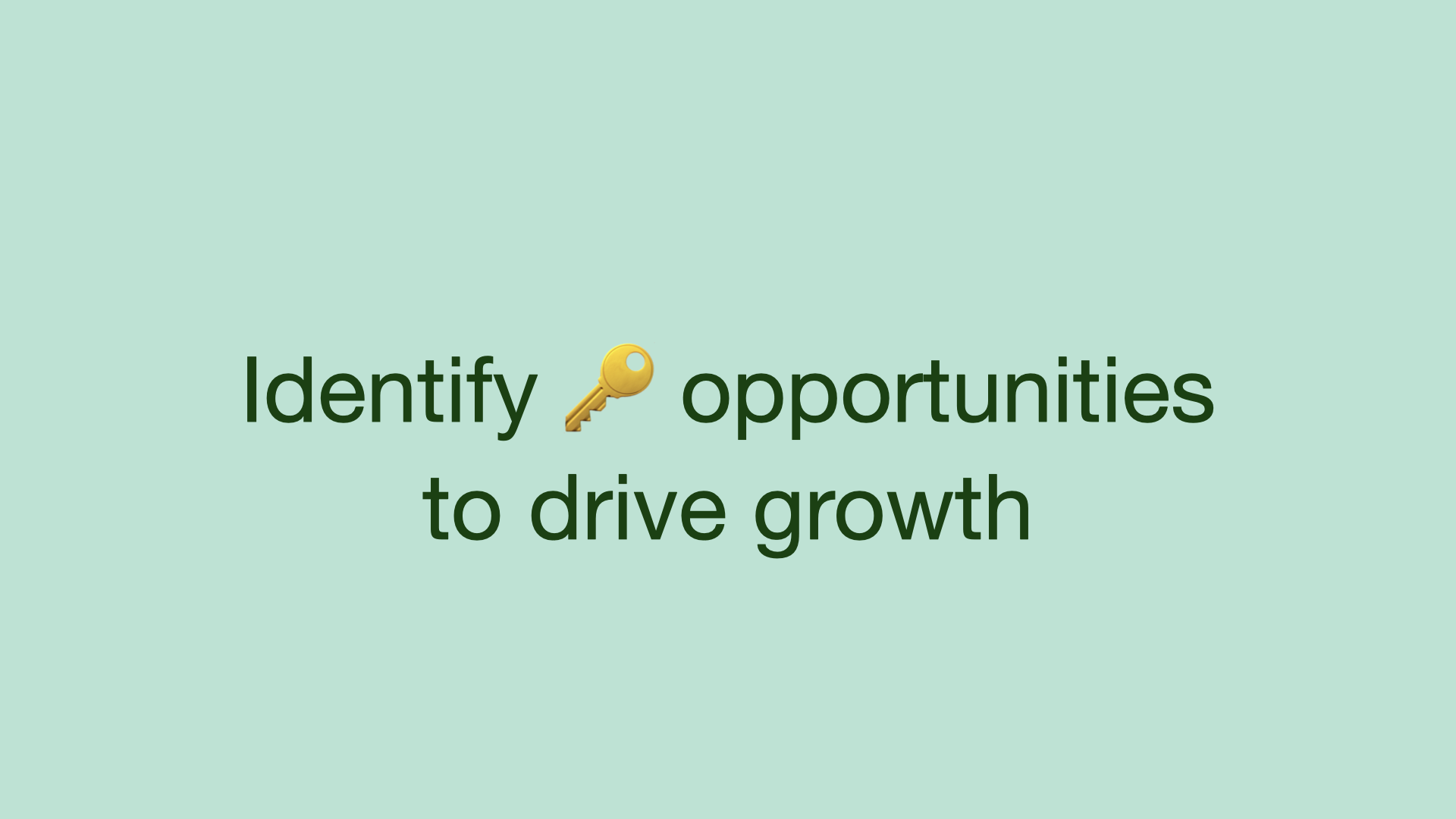
The first step of the growth triangle is to identify key opportunities to drive growth. Here are some ways designers can do this:
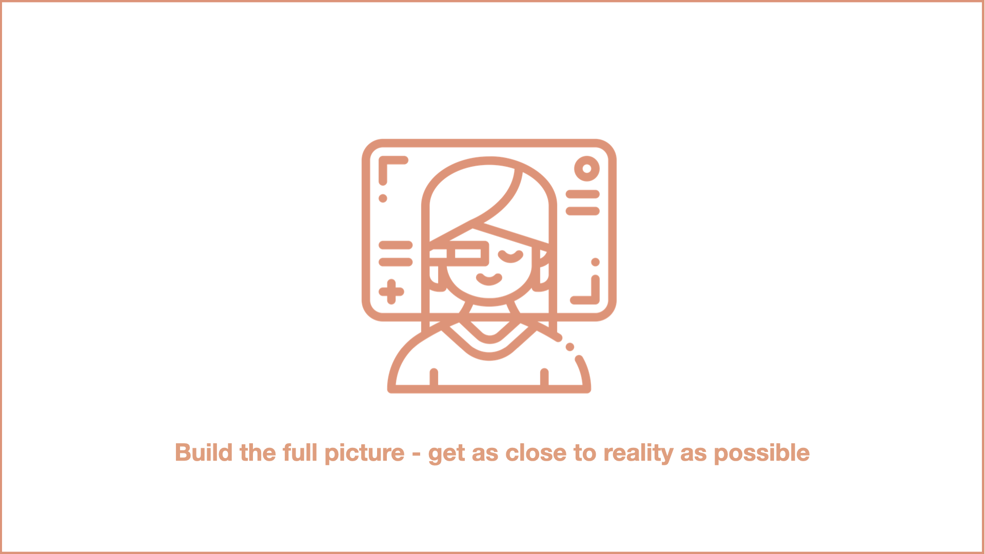
One way is getting as close to reality as possible - building the reality picture. This means effective user research, measurement, understanding the market and understanding the business
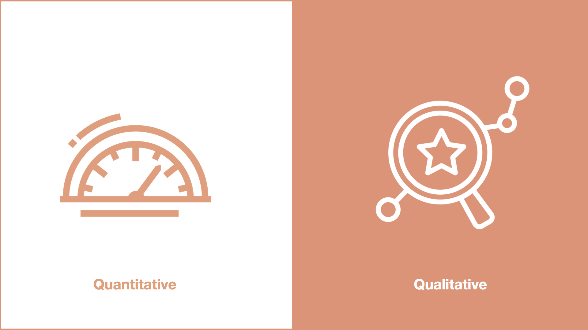
Synthesize qualitative and quantitative data to get the the best, most complete picture of reality.
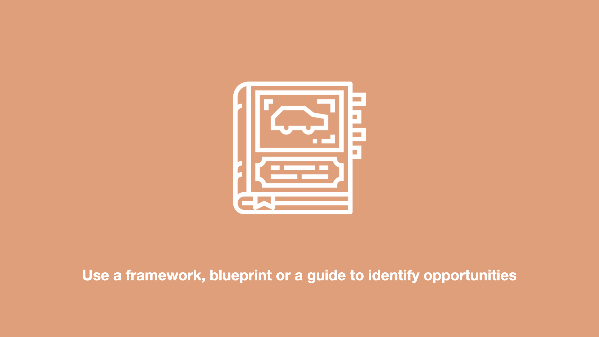
Use a framework, blueprint or a guide to identify key opportunities for growth
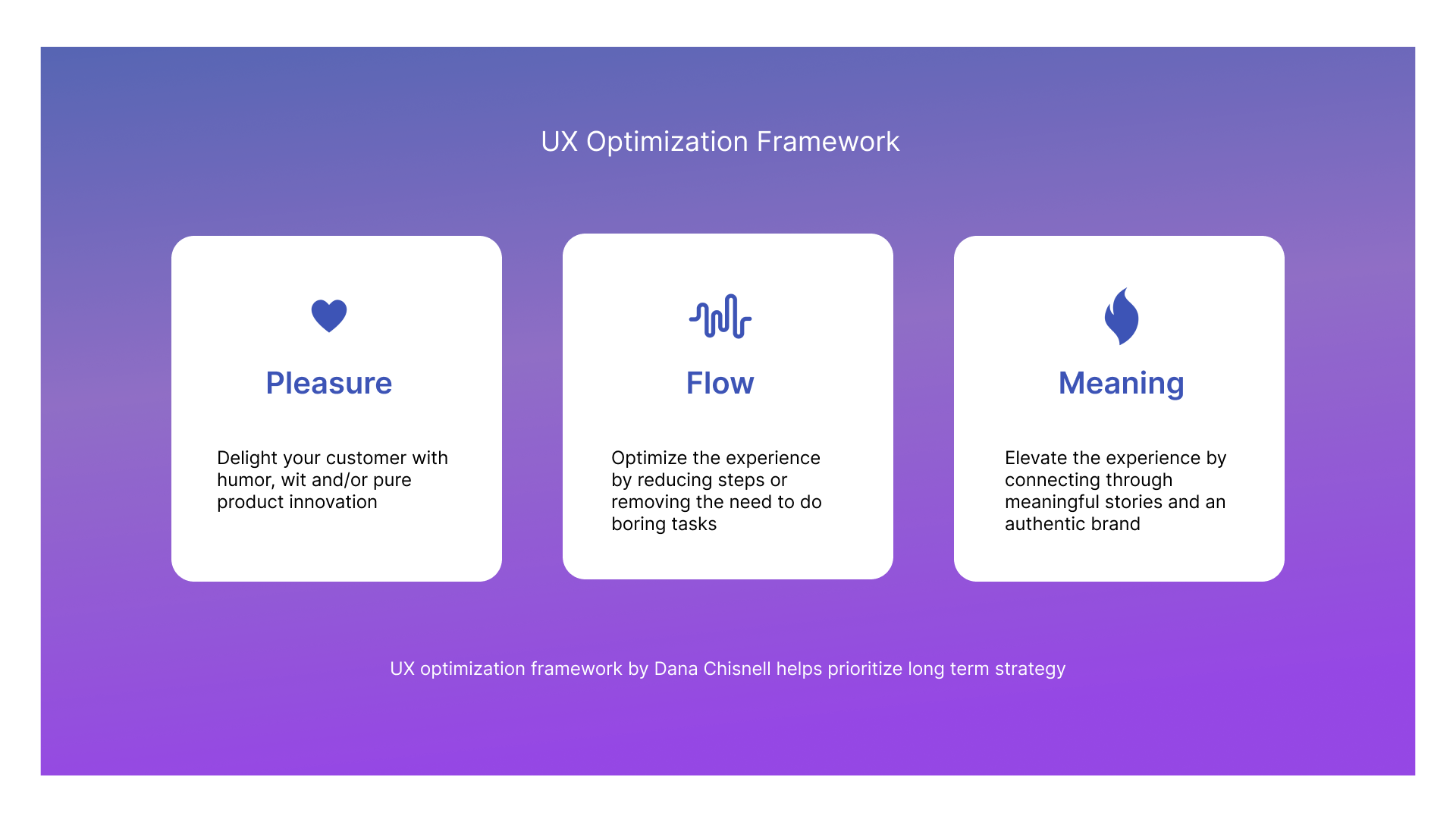
An example of a framework that can help you identify opportunities for growth is this UX optimisation framework by Dana Chisnell.

Another example of a framework that can help you identify key opportunities for growth is the HEART framework by Kerry Rodden. She used to work at Google as a Senior Staff UX Researcher. The framework will also help you build a holistic reality picture by combining behavioural and attitudinal metrics
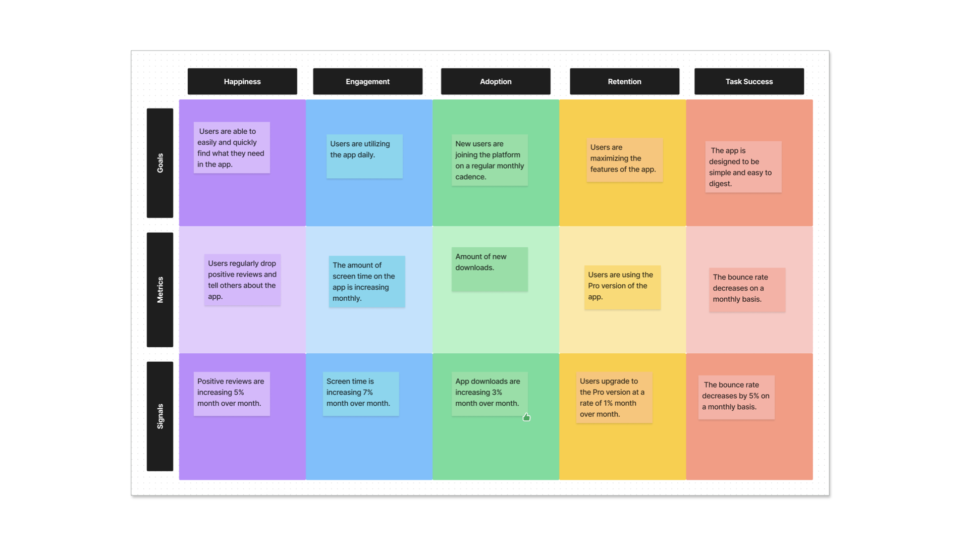
This is an example of the Figjam team using the HEART framework to identify key opportunities for growth.

Minimal Viable Products, Minimal Lovable Products, Product Market Fit - these are all frames and ways of framing to help you identify opportunities for growth.
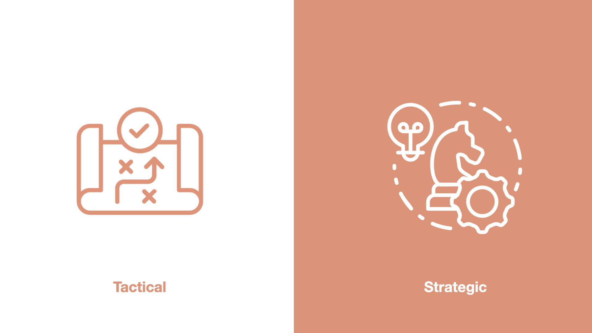
Think about whether you are being tactical or strategic as a designer. Let’s take the example of redesigning the logistics website aramex.com:
Being strategic means: Change and transform aramex.com brand perception so it appears like a more digital and modern company
Being tactical means: Update the visual design and UI elements of the website so it looks more clean, modern and minimal
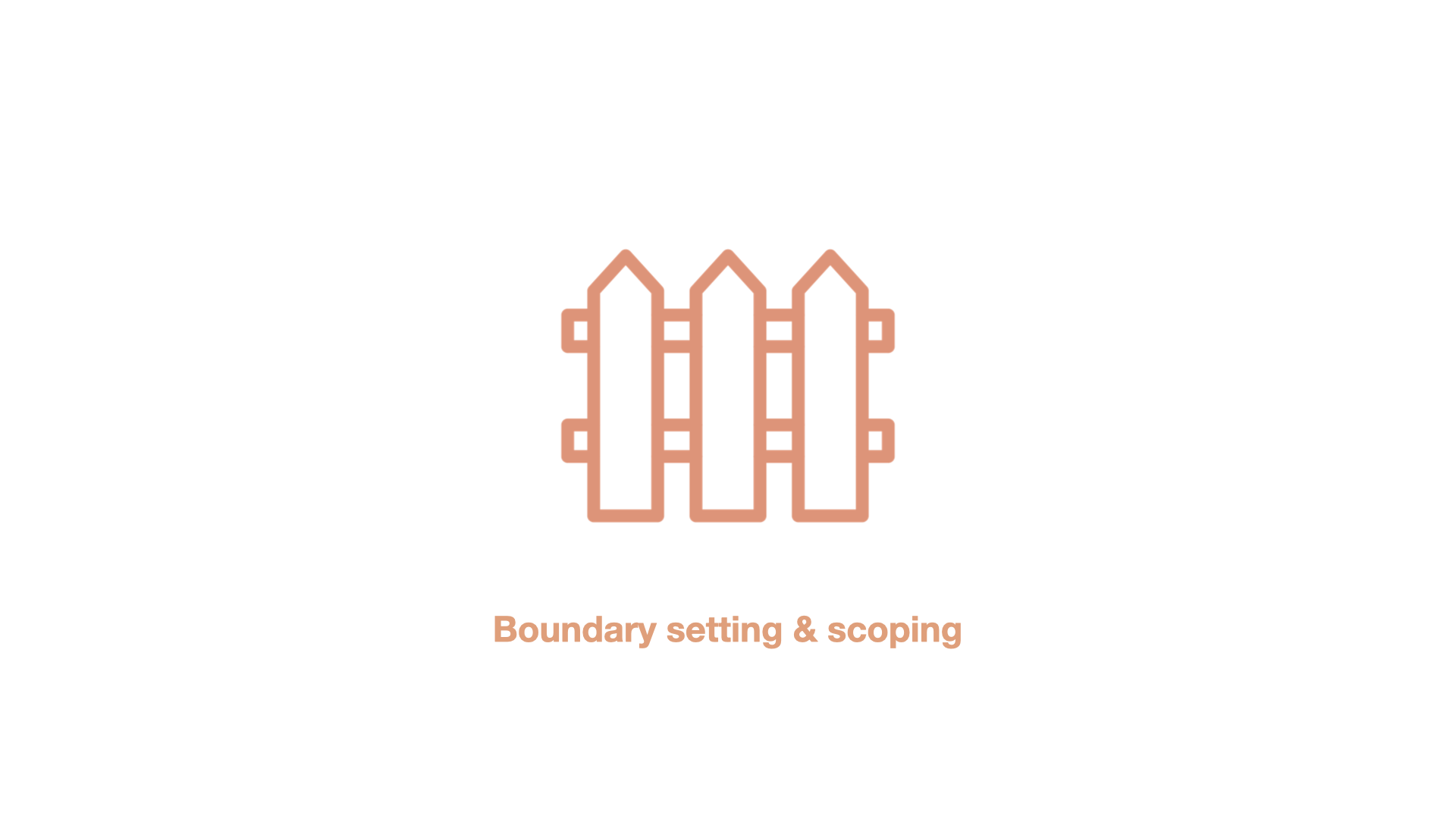
Another thing that can help you identify key opportunities is boundary setting and scoping. Setting clear constraints, timelines and scope will help you come up with better growth opportunities.
So to summarise you can identify key growth opportunities with design by:
Building a realistic, holistic picture using qualitative and quantitative data. Developing a deep understanding of the market, business and your customers
Using frameworks and guides as a lens - each providing a different framing like HEART, MVPs, MLPs, and the Dana Chisnell Framework
You can identify opportunities by being strategic instead of being tactical
Boundary setting and scoping can help you focus on an area of effectiveness rather than trying to redesign everything at the same time
2) Metrics
So that is the first side of the triangle which is identifying key opportunities for growth.
The second part is about measuring your design success or UX success. If you aren’t able to actually measure the impact of the design that you have done, it’s going to be very hard to prove that your design lead to the growth of the business. And that your design actually works.

Numbers are not your enemy if you love aesthetics and you are a designer. Numbers are your friend.
Use numbers as a communication tool. Numbers are a form of communication with non-design ppl. It’s sort of like speaking the language of the person you are speaking to
When you talk a bunch of stuff about your design craft. The person on the other side may not be ready to understand what you are saying. Then you need a translator (e.g. product manager) to explain everything.
How do we know when we are making the experience awesome for humans? How do we know that our design is leading to growth? There are many ways we can get data on how people are experiencing a thing we have made.
Types of metrics
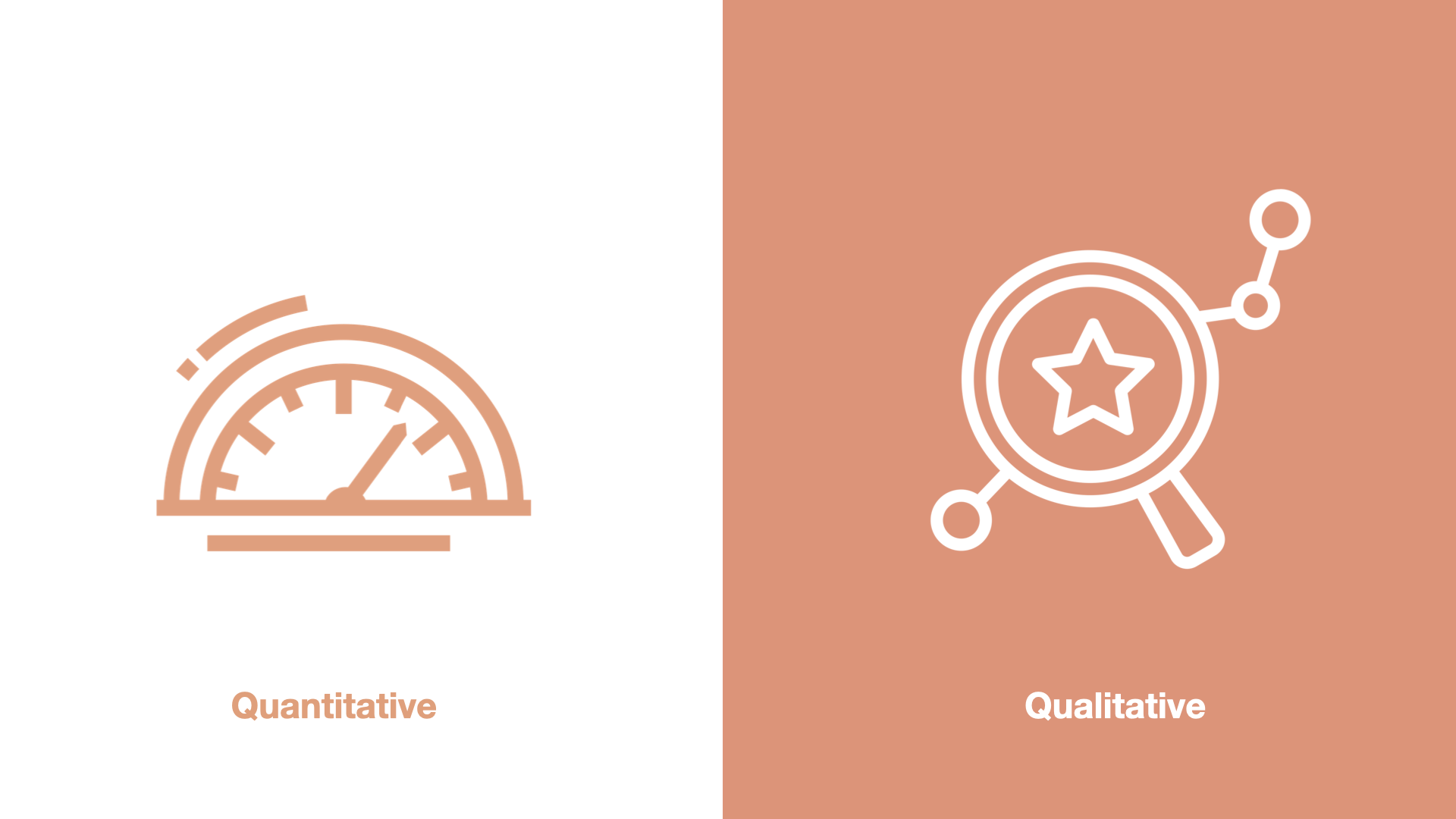
There are 2 types of data you can have about the people who are using your experience. Quant data and qual data. Qual data is more anecdotal, rich, with words - like interviews and photos etc. Quant is numbers.
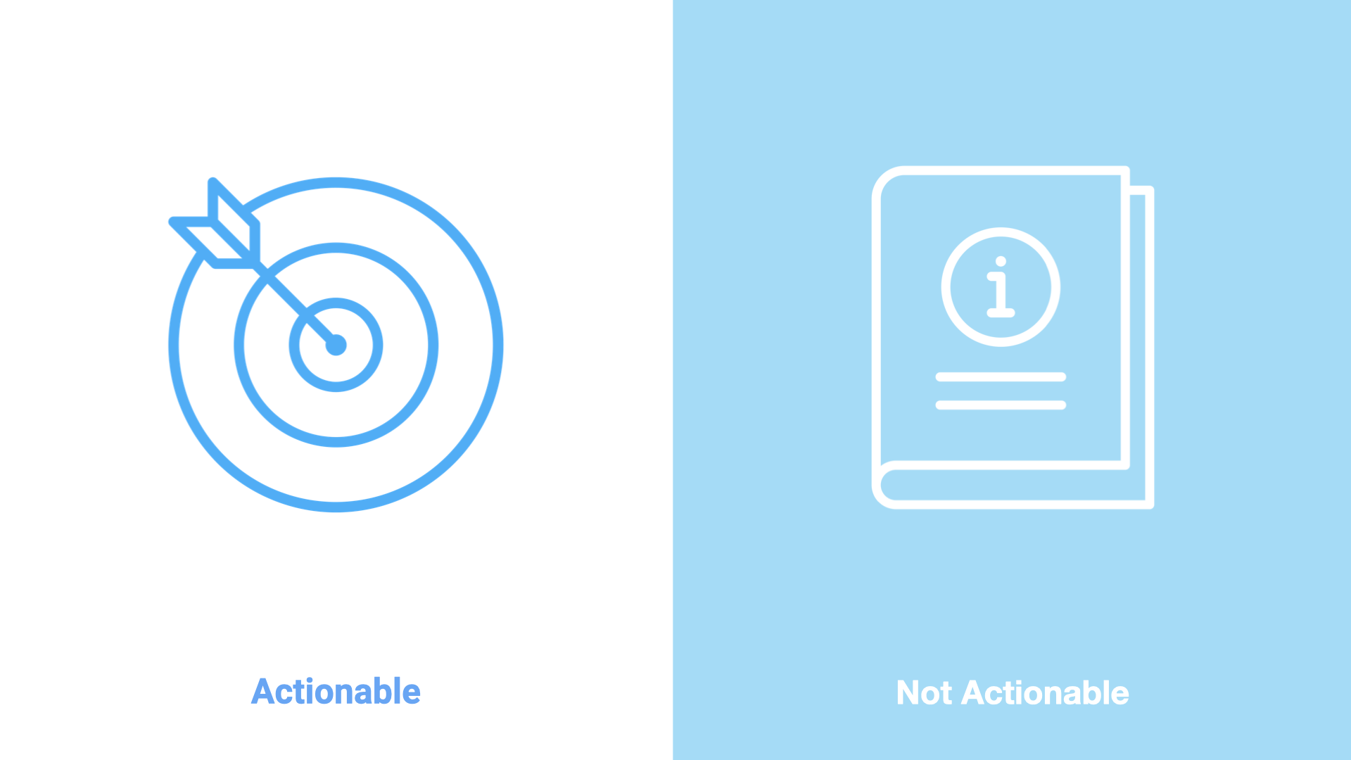
Actionable vs non-actionable or informational metrics is another way to look at metrics. Not all metrics are actionable for us as designers.Non actionable metrics are just informational metrics. An actionable metric is time spent on filling a form. We can use design to reduce time spent, so that is actionable.
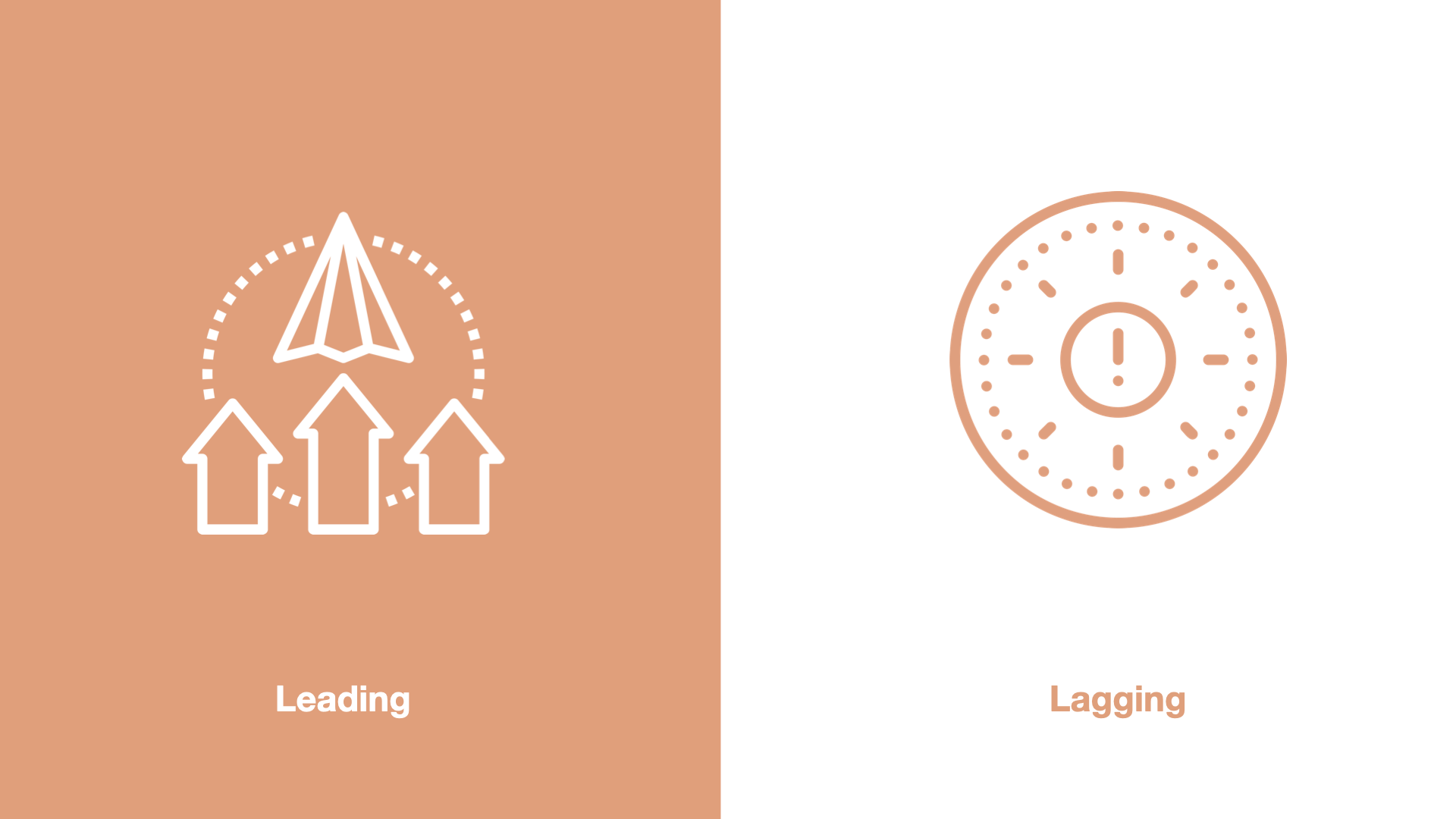
And then there is leading vs lagging metrics. Revenue is a lagging metric. We only see the revenue impact maybe weeks or months after we ship something.
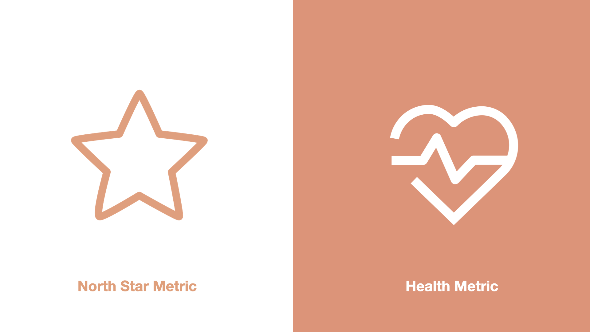
North star metrics vs health metrics or counter metrics are another good way to look at metrics.
Good examples of counter metrics include countering trial signup conversion rate with paid subscription conversion rate, Monthly Active Users with product feature usage, and development velocity with the number of bugs found (source)
So if your PM has only a north star metric and no counter -that’s usually a bad sign for designers. We need that balanced view.
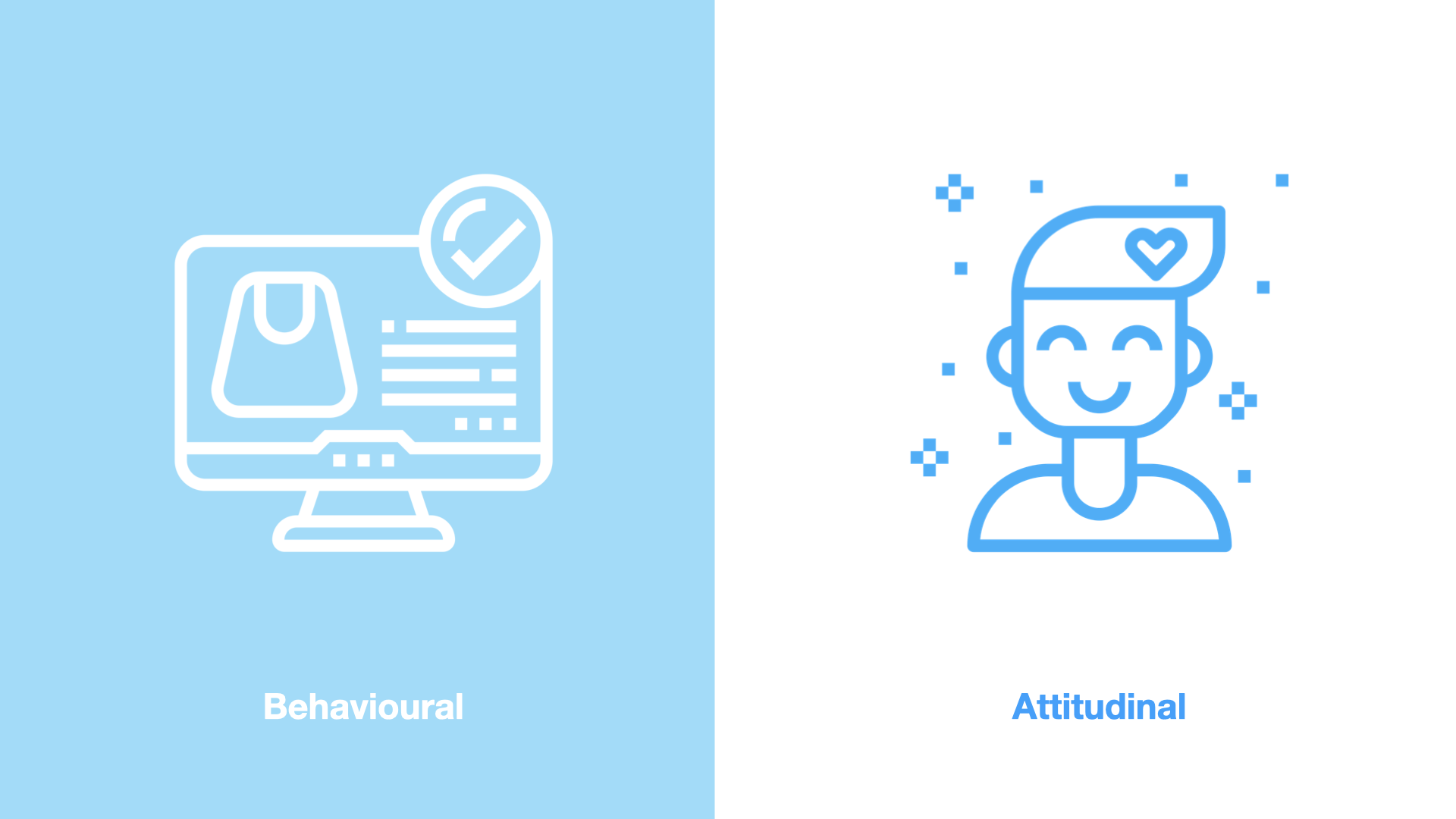
And there are two types of metrics for UX - behavioural and attitudinal. Behavior is the things people do when they are using the experience you have designed. For e.g abandoned checkout rate, churn, retention, time spent and task success. Attitudinal is things people say or say they feel when they use the experience or after they have used the thing. This is satisfaction, usability, credibility, desirability. So for e.g. how usable do you think this chair is on a scale of 1 to 5.
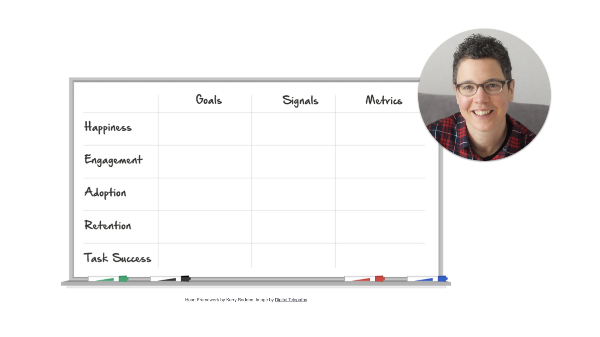
Frameworks like HEART by Kerry Rodden (who used to be a researcher at Google) will help you build a combo of behavioural and attitudinal UX metrics to get a more filled out picture. Happiness for e.g. is attitudinal we can’t know it for sure. We can only ask how happy or satisfied are you with this. And then retention and task success we can actually measure.
There are many metrics that don’t neatly fall into these categories and also affect the users experience. For e.g. latency and uptime. If you have high latency aka very slow situation during checkout - it can lead to a bad experience and lower conversions. So be flexible and open to use other metrics to inform you on how good or bad the UX is.
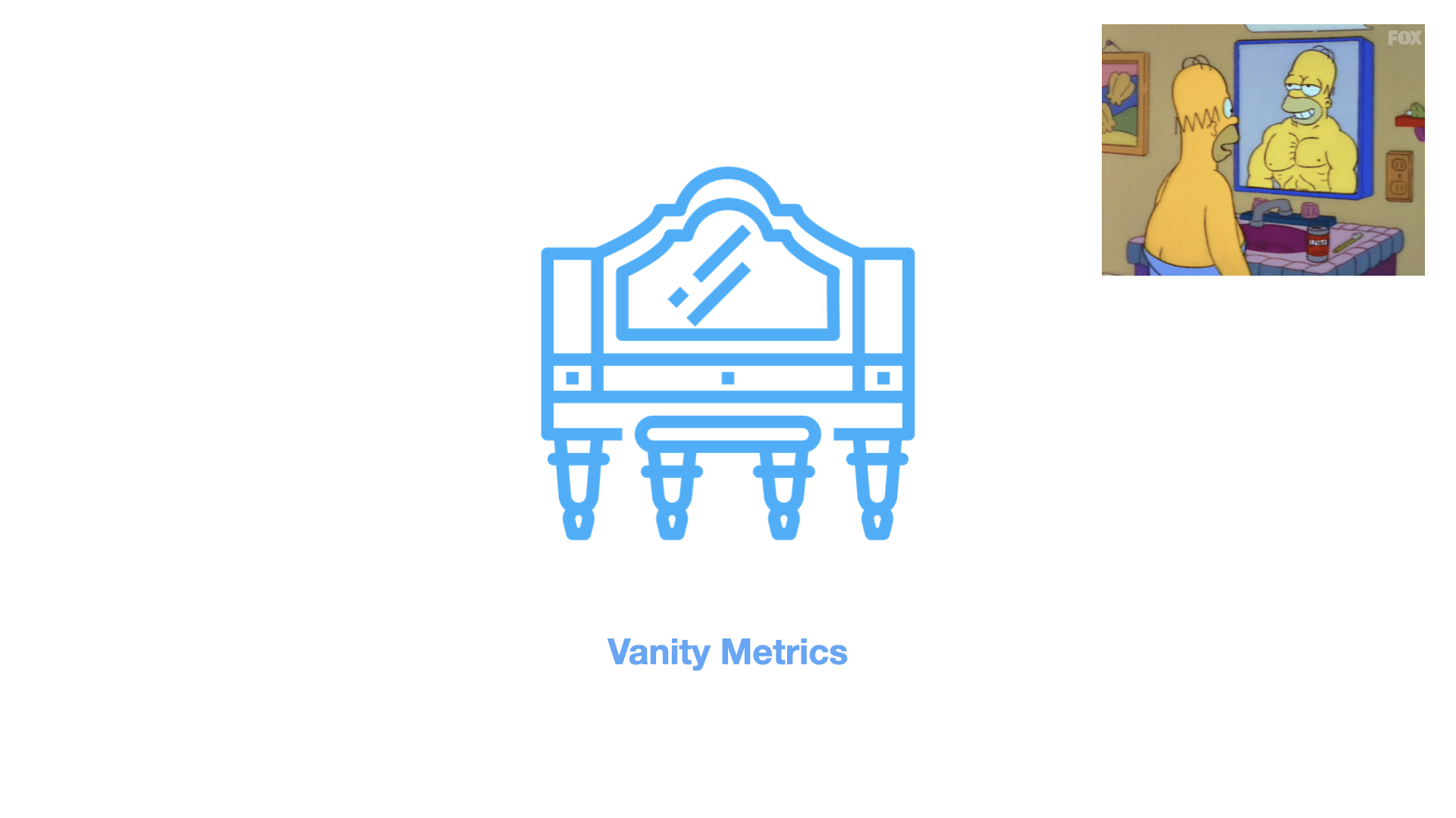
There’s also vanity metrics - which are designed to be impressive. For e.g. the number of people who viewed your profile on LinkedIn. Vanity metrics don’t mean anything but they make you or the organisation feel cool.
So to summarize, you can measure the effectiveness of your design using UX metrics.
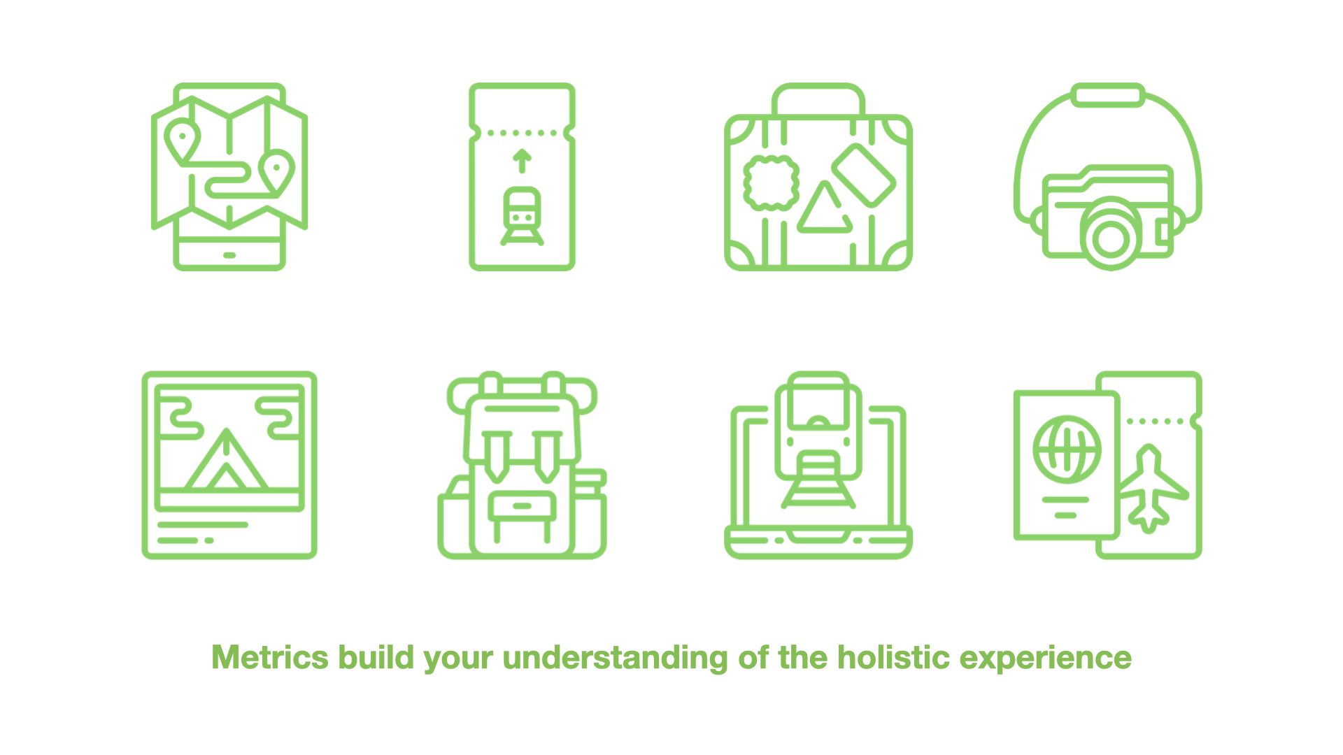
There are different kinds of metrics that will help you measure whether you are making the experience awesome for humans. Which in turn is leading to the growth of the business or software you are working on.
Numbers are your friend and a communication method so that non-designers better understand your efforts towards building an awesome experience. Diff types of metrics are:
Qualitative vs Quantitative data
Actionable vs informational / non-actionable metrics
Leading vs lagging metrics
North Star vs. counter metrics or health metrics
Behavioural vs Attitudinal metrics
Frameworks like HEART combine behavioural and attitudinal UX metrics to give us a fuller picture
And of course we can’t forget Vanity metrics that are there to make the organisation or person feel better about themselves

An important note here on metrics: as designers we instinctively distrust the numbers and that’s good. Don’t lose that completely. Sometimes anecdotal data will tell you the opposite of what the quant is telling you. Ask questions and trust your gut. I’ve seen it many times where a chart looks off based on my interviews, I ask questions and the data scientist finds a bug in the chart. The opposite is also possible so comparing qual & quant data is the key to your users.

So we’ve covered a few ways to identify key opportunities, and different types of metrics to help you measure whether your design works or not. And remember - numbers are your friend. The last section of our talk completes the growth triangle.
After you have designed the right thing, and measured it successfully. Now you have to do the most important step. Which I call - value formulation.
3) Value formulation
Value formulation is the hardest and most important step in the growth triangle for design. After you have identified key opportunities, designed a good solution, measured the impact of your designs and demonstrated that metric impact to the business. IT IS STILL NOT ENOUGH.
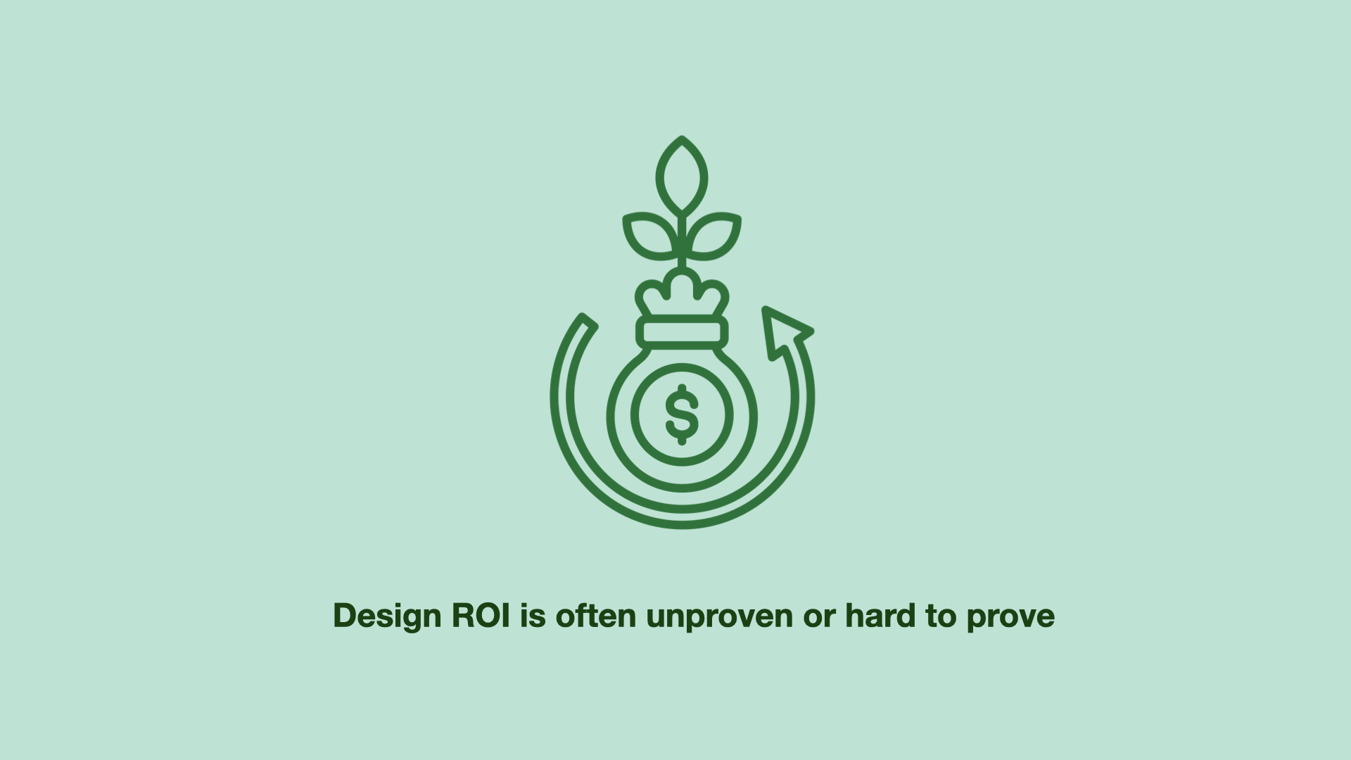
Design ROI (Return on Investment) is one way an organisation decides how important the design function is to growth. Even if you create impactful designs that lead to real growth in the business - it’s not enough in the long run due to how hard it is to prove Design ROI in a sustainable manner.
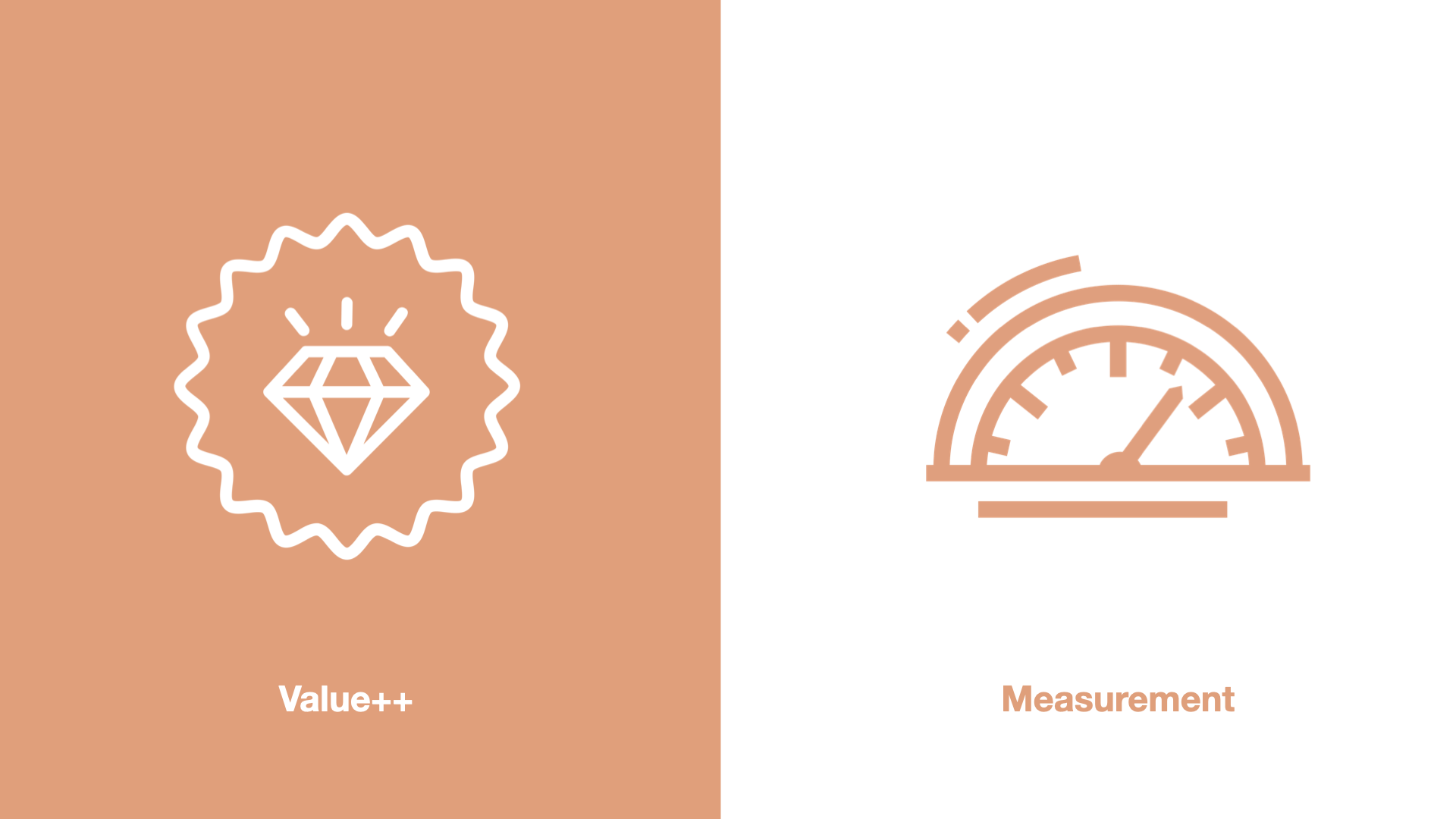
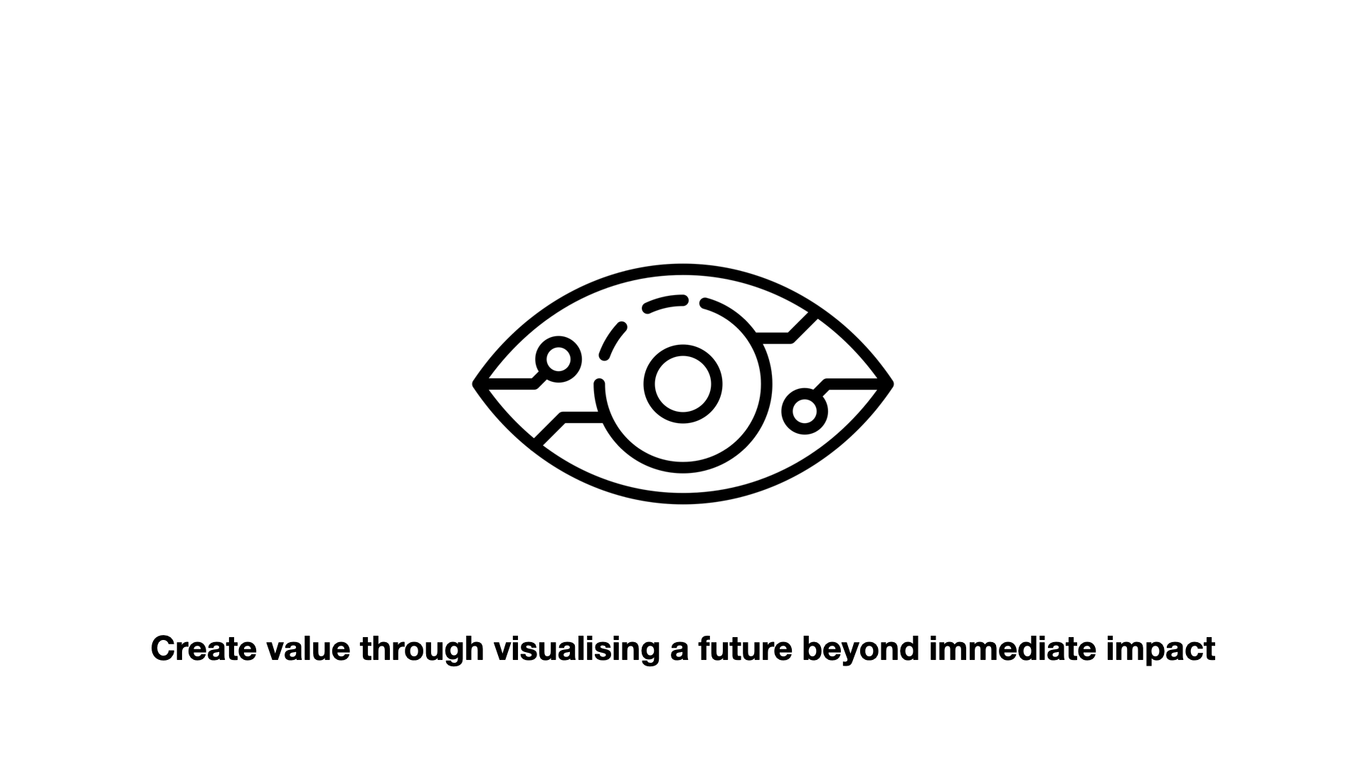
Create value beyond pure measurement impact. As design visionaries, we have this unique capability. Value is more long term, and the organization will see design as more than just delivery of metrics success but more long term vision.
For e.g. your redesign may lead to 3% increase in conversion rate. But you can provide a lot more value beyond that measurement metric that you have just delivered.
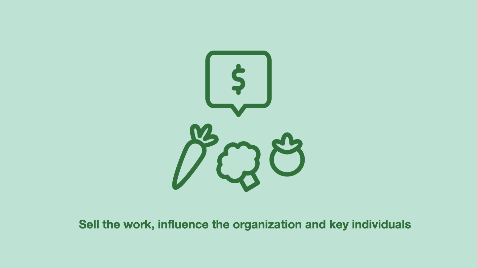
Repackage your impactful design solutions with value++
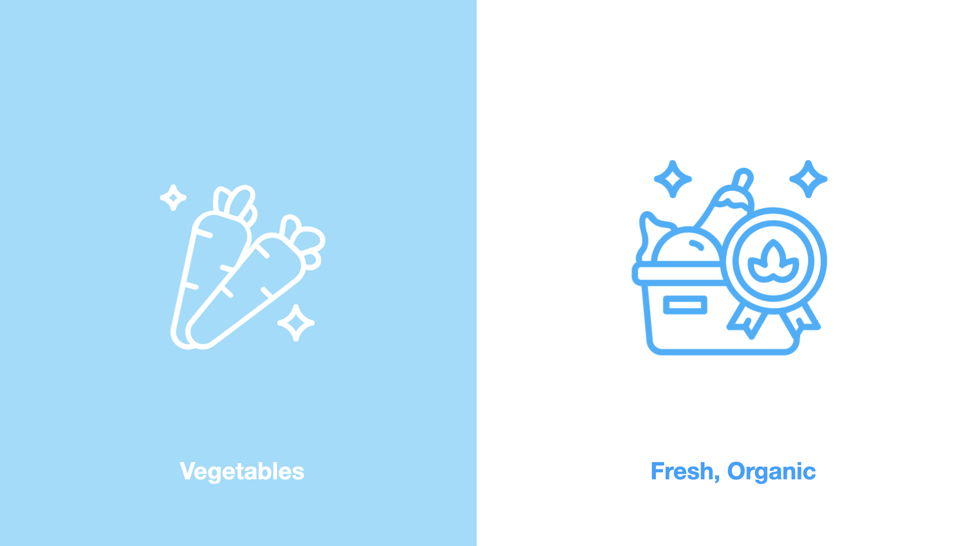
For example, let’s say you are selling vegetables. You can make the veggies look cool and do cool packaging. But once you brand the vegetables as “Fresh and Organic” suddenly the vegetables have more value. This is an example of value formulation. What I am saying is that we should do the same thing with design.
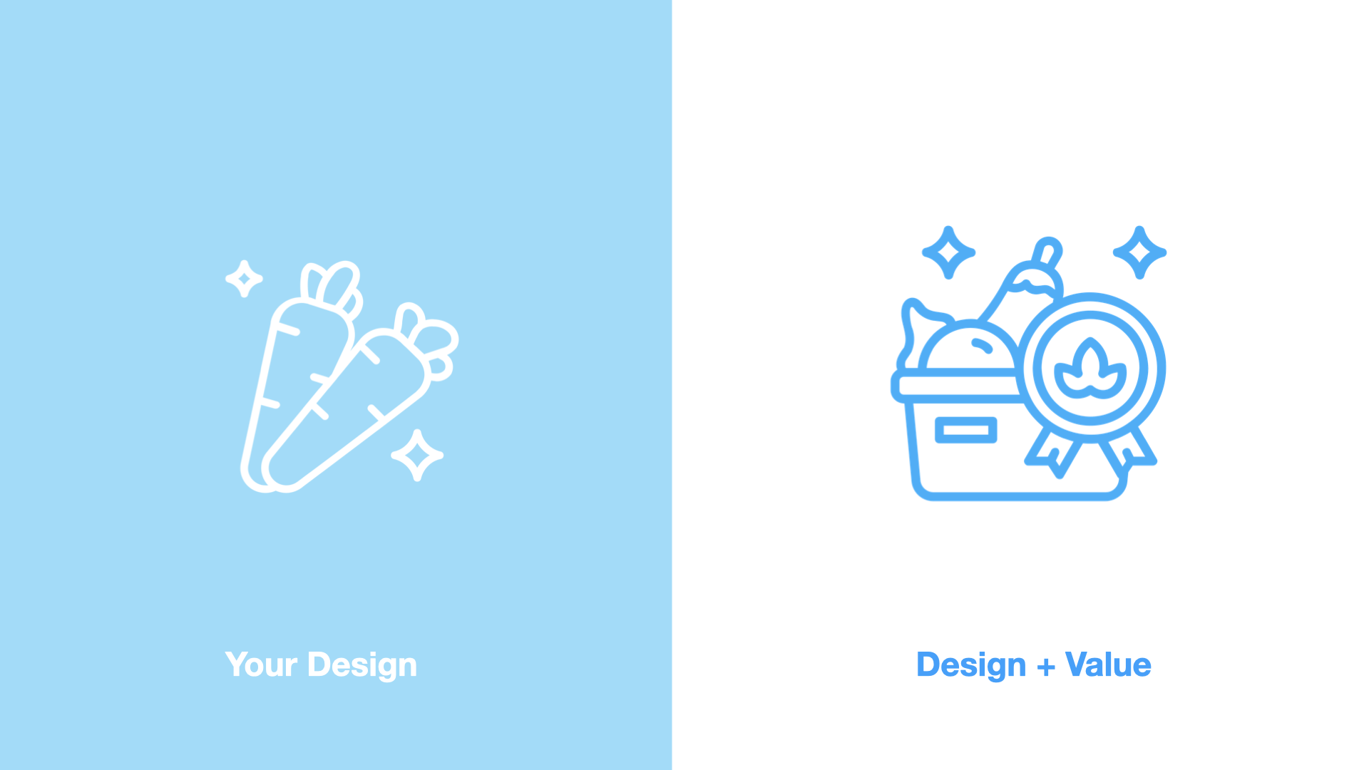
So here you have your design. Which you have made with hard work and labour in Figma. Once you add value++ on top of that design - suddenly that design is ELEVATED.
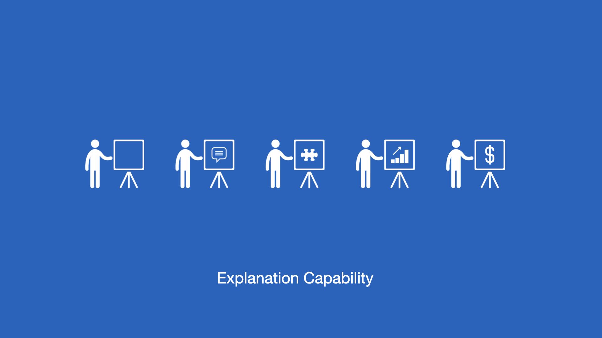
Demystify design with explanation capability
Another side of creating value - is creating understanding.
Explanation capability is a concept I recently learned from Professor Barbara H. Wixom. She talks about this in the context of getting organisations to trust AI. When AI models are opaque and difficult to understand, it becomes even more difficult to prove to the business that AI is making a real impact.
It’s the same with design. If the organisation doesn’t trust and understand your design processes, and how you make decisions, then even if the metrics go up - the organisation may not assign that value to the design function.
Another way to create value is through the Flywheel effect - which you will hear ALL product people talk about. It was created by Jim Collins in his book Good to Great.

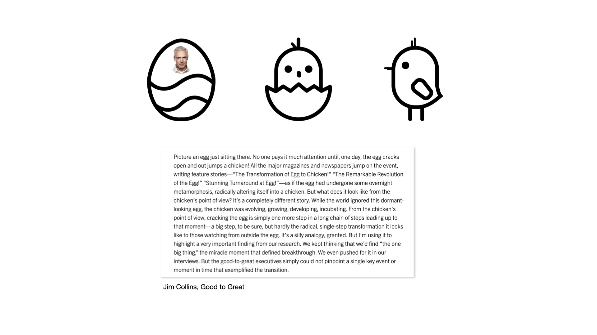
He explains the Flywheel effect through a simple story about an egg that hatches into a chicken. In this story of the egg, he talks about small changes that lead up to a big transformational change - basically the egg becoming a chicken is a transformational change. From the outside it looks sudden but from the inside we know that so much work and so many small changes lead to this big transformational change.
So to summarise, the last side of the triangle - the hardest part. Is creating value. We can create value beyond the immediate impact of your design by:
Recognising that design ROI is often unproven and hard to prove in a sustainable manner
Create value by developing a future vision with design
We can create value beyond just the immediate, measurable design impact
Explanation capability is key to build trust in the organisation
And of course create value through the flywheel effect! - millions of tiny changes leading to a big transformation - GROWTH
We’ve now covered the three sides of the growth triangle through design = identifying key opportunities, measuring your design impact with right metrics and then highlighting the additional value of your design through value formulation.
None of this is easy to tie up neatly in a bow.
When all three sides of this growth triangle combine it can work in most organisations - big or small no matter which business or technology you are in - it can lead to real GROWTH.
If you read through this entire visual essay, thank you! If you are just skimming - I am very grateful as well. Please add your thoughts and comments below I would love to hear from you.
Note: This is a summarized version of talks and workshops on growth I’ve shared between 2023-2025. The interactive workshops and talks contain additional material including case studies, practical project examples and stories from my real life work experience with Youtube, Google, TikTok, Shopify and various startups. Contact me to sign up for one of these workshops or talks for your team or company. My recent talks and workshops on growth:
Speaker at Dell APJC Design week Australia, 2023
Growth Masterclass with Ownspace & Freshworks, 2023 (2 day workshop and talks)
Types of Metrics L&D at SEEK APAC, 2024
Keynote speaker at Salesforce Design Days, Singapore, Oct 2025